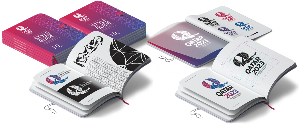
Branding
Event
Motion
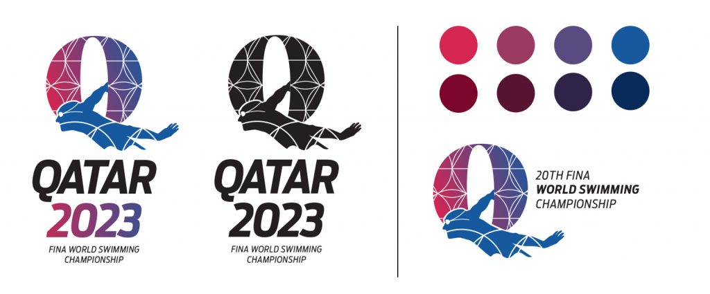
Qatar
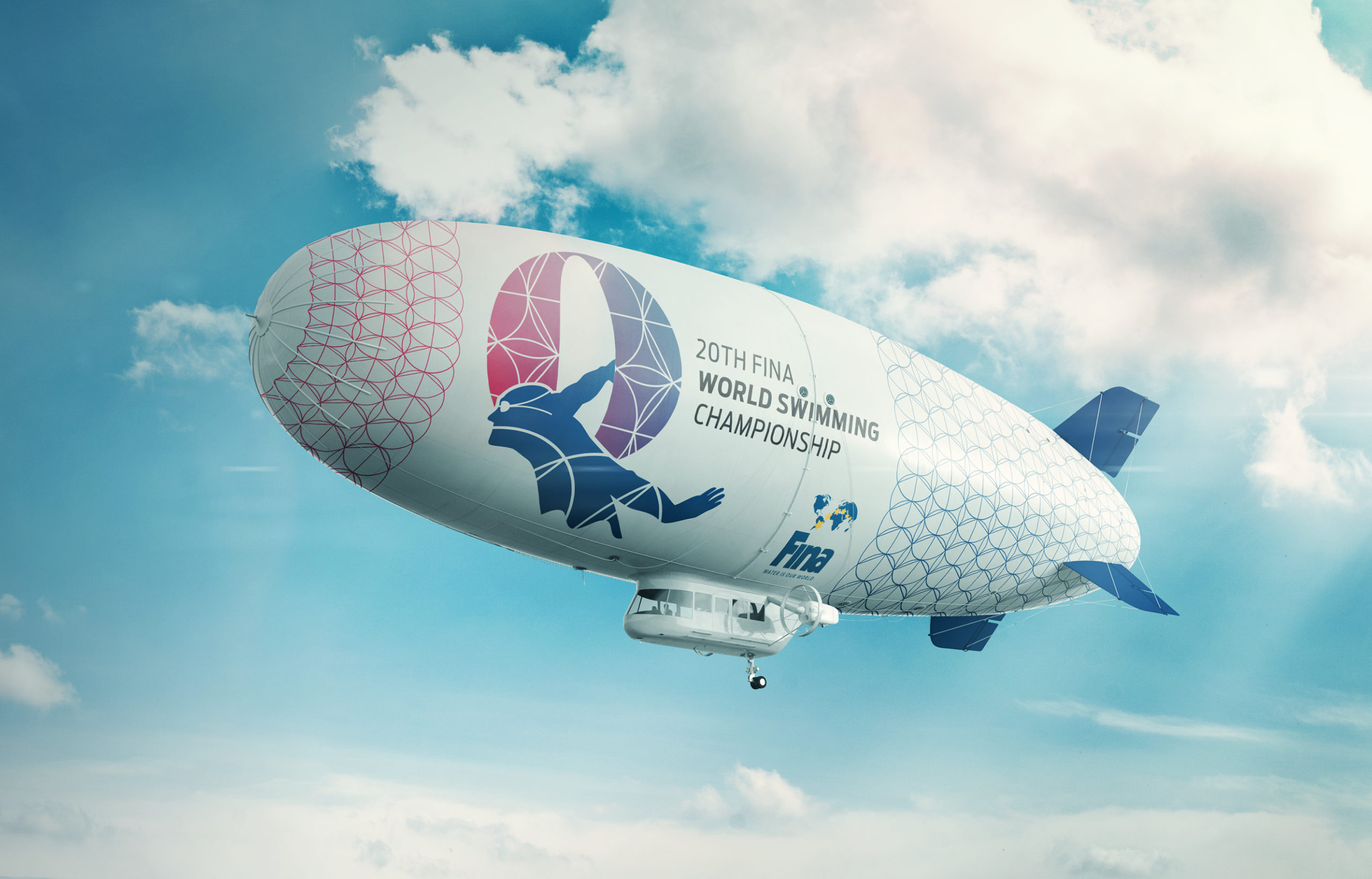
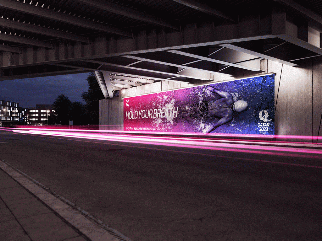
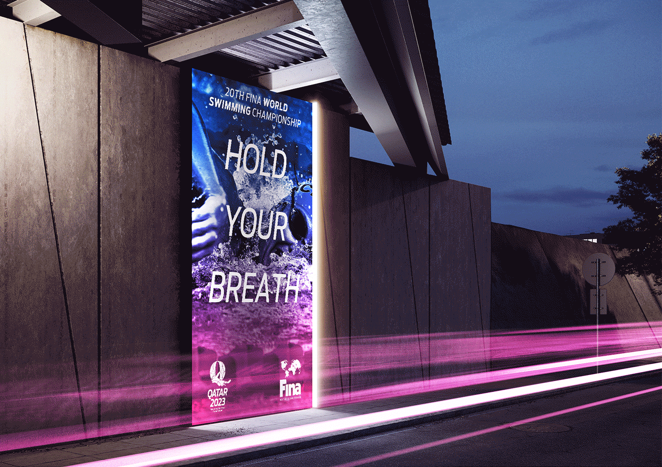
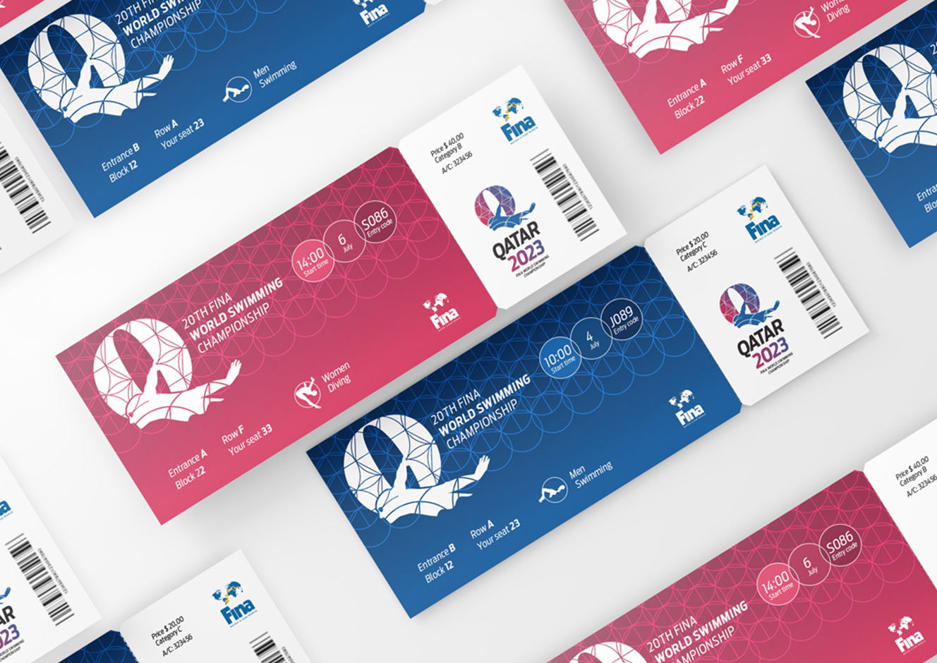
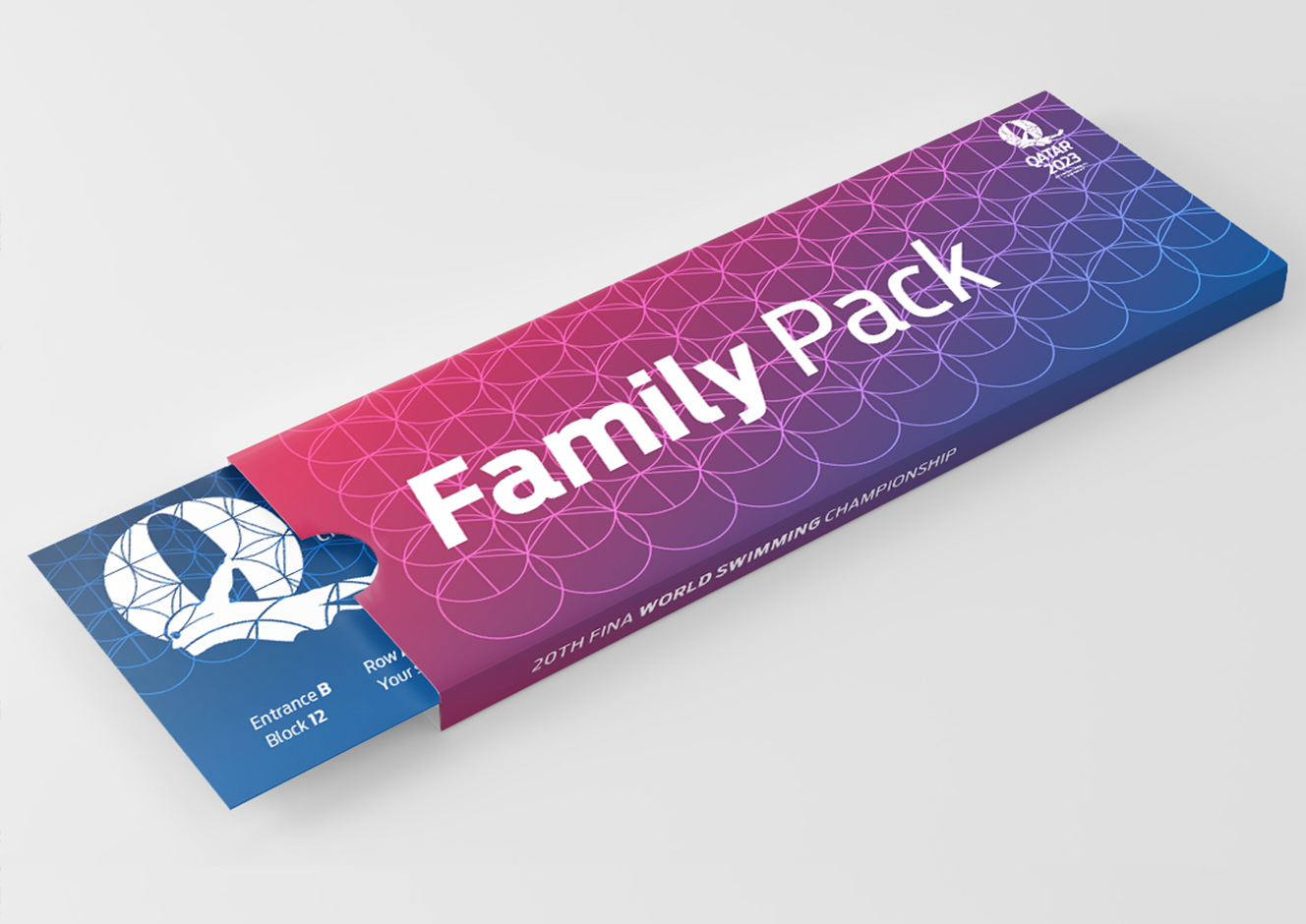
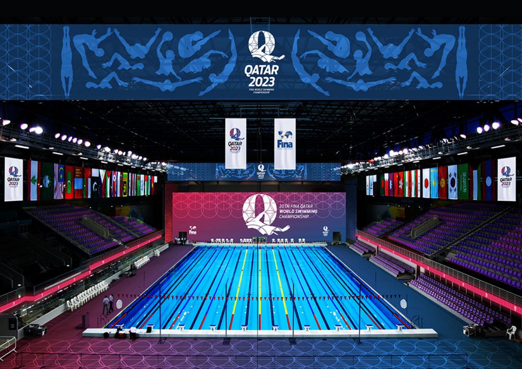
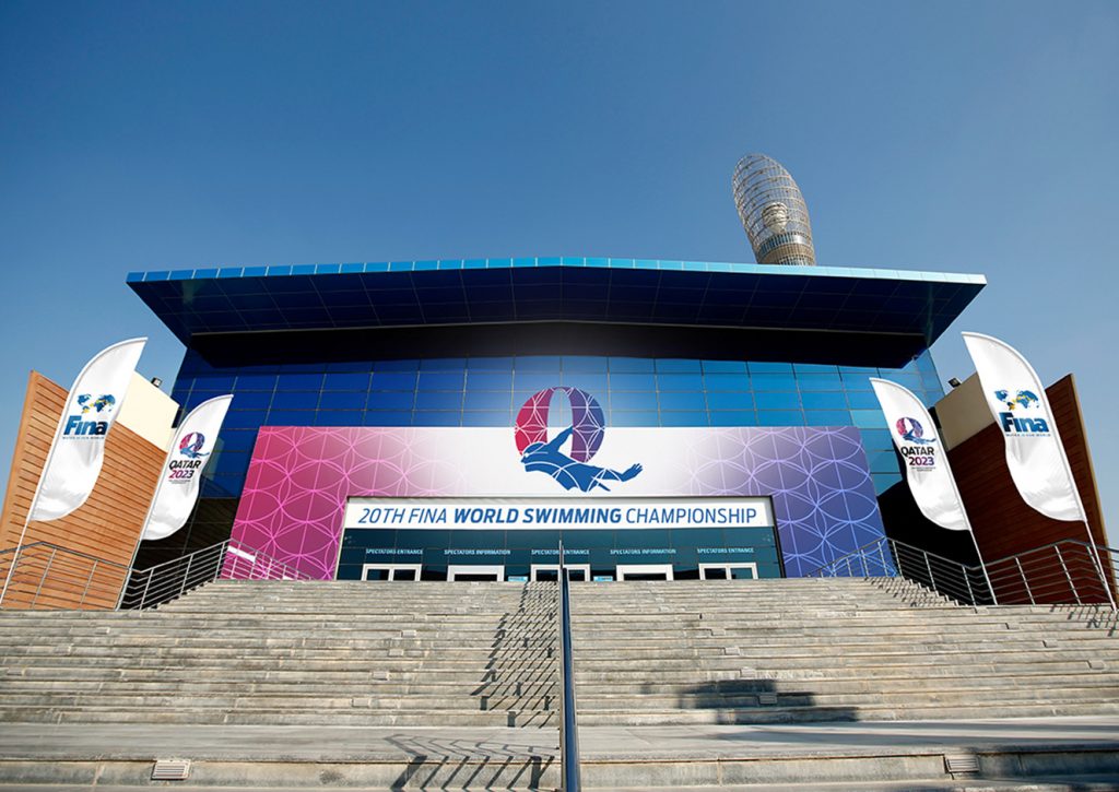
For every swimmer, water is something he loves, something he respects. He knows that there inside, is where mind and body need to be one. He knows he needs to swim with the water, not against it. The Qatar 2023 brand lives where the game takes place: the identity and graphic system are inspired by the movements that happen inside the water.
Task
Design a brand that completely embodies the sport— a brand made of swimming.