Exactly 2 years ago I was in Brasilia (capital of Brazil) redesigning the first page of one of the must traditional newspapers in South America.
Correio is a newspaper with a rich history, founded in 1960. Known by its visual appealing (awarded as “World Best Designed Newspaper” by the SND), I had the honor to work there as Art Director, and to have the possibility to develop this project.
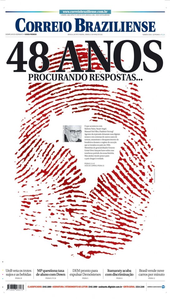
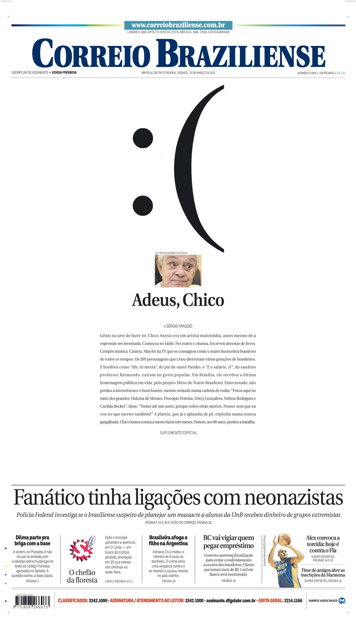
The Covers of Correio are famous by its creativity, often with a approach more like a magazine would do to a topic.
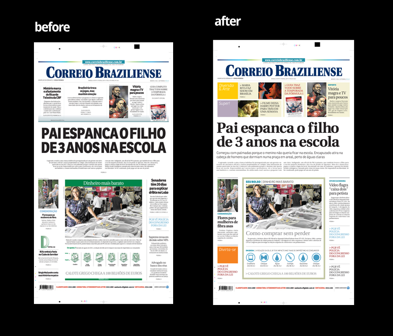
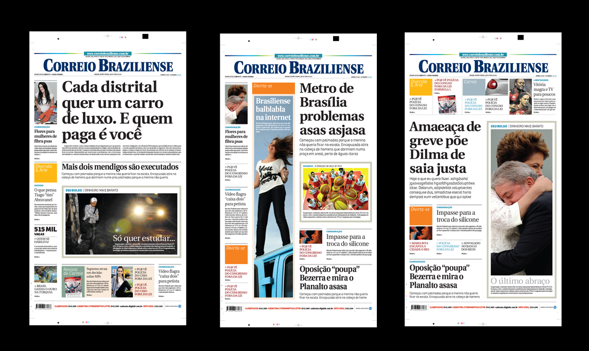
For this project, simplicity was the key I mainly used. Create a sense of hierarchy, was essencial to allow the possibility to such strong approach that from times to times popup in Correio first page.
Here are some pages done as sample pages for the project and as a base for the development of a Style Book. (in the first image the comparison “before / after”, working only with the new elements. Bellow, the use of the new elements applied to the new project with the different approach to the topics).
Short after the launch of the new project, I was very proud to be awarded by the SND (USA) and by the ESSO award (most important journalism award in South America):
I am not in Correio anymore, but the talented team of that paper continuos with the same appealing and strong approach in its Cover, that from times to times run around the world.


