Every time I enter in a newsroom to redesign a magazine or a newspaper, what I do first is: nothing, just listen.
Listening from the Chief Editor, which view he has about his actual magazine (and not what he wants to change) and making the right questions about his publication, brings him to think about details that he maybe never thought before. Ask the right “whys” to get the valuable “becauses” is the key for the entire project during the months after this first step.
It is incredible that every decision, plan, redesign, rethink in the future, bring us back to that first step.
Auto Bild is one of the biggest car magazines in the world. It was a great and “crazy” adventure to spend some months in this newsroom. Great, because of meeting a very smart Chief Editor (Bernd Wieland), who deeply knows his readers and the real essence of the magazine. Crazy, cause the time for the relaunch was too short and I didn’t want to risk the quality of this first step.
With the team of Auto Bild we rethought the entire magazine; rethinking sections, elements and the way of telling stories, emphasizing elegance, directness and good navigation
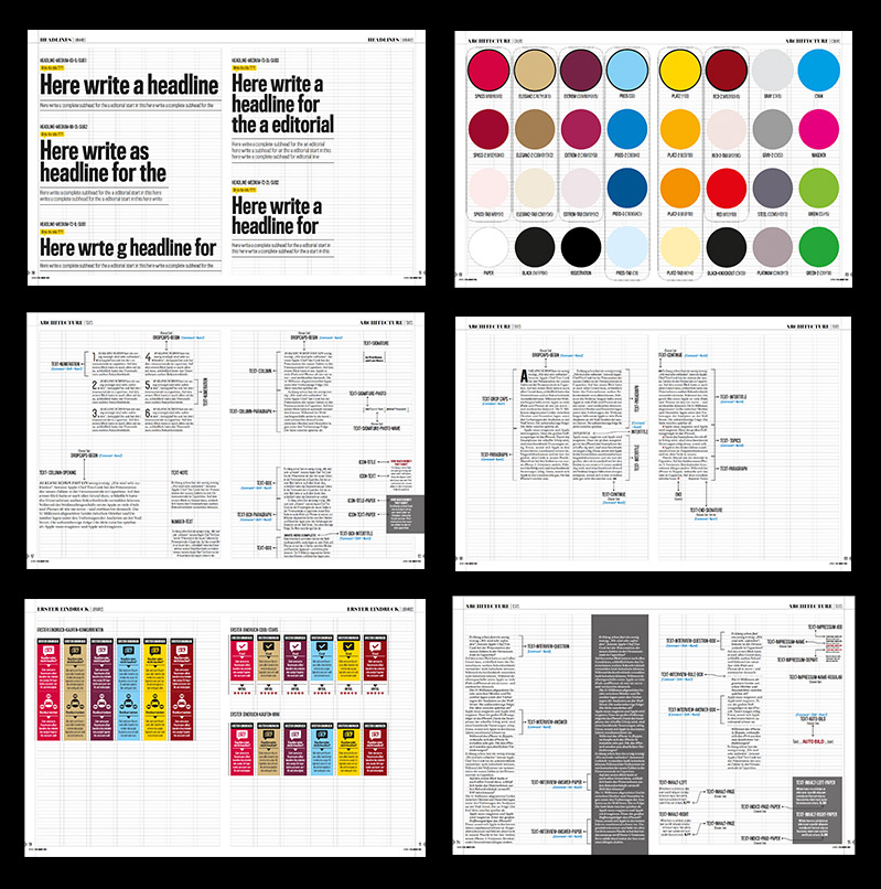
We wanted the reader to decide about his priorities on the magazine with the “what you must know, read and do”. Hierarchy gives way to a enjoyable and more intuitive reader decision for every story.Bellow, I compare the redesigned magazine with the old one (I normally do the number zero taking the content of a real issue) and some highlights from the Style Book, Library, Architecture and Text Newsroom Manual developed for the new project.
Bellow: grid, color pallet and typography. Few highlights from the more than 100 pages given to the newsroom as a project book (Style book, Architecture, Templates, Library and Manual).

