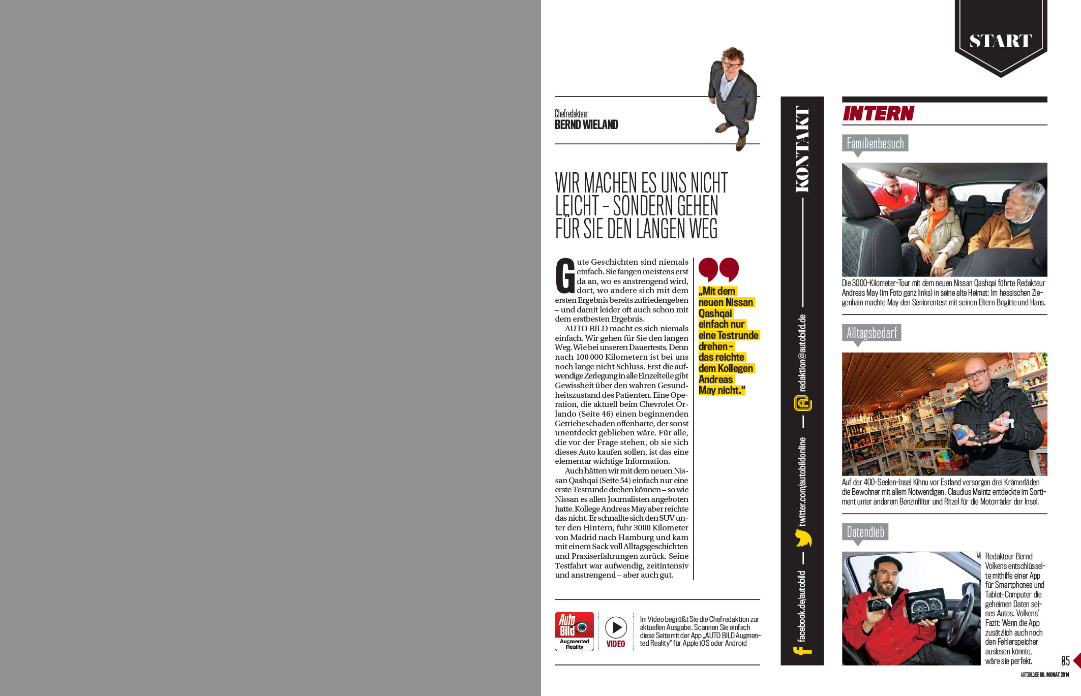
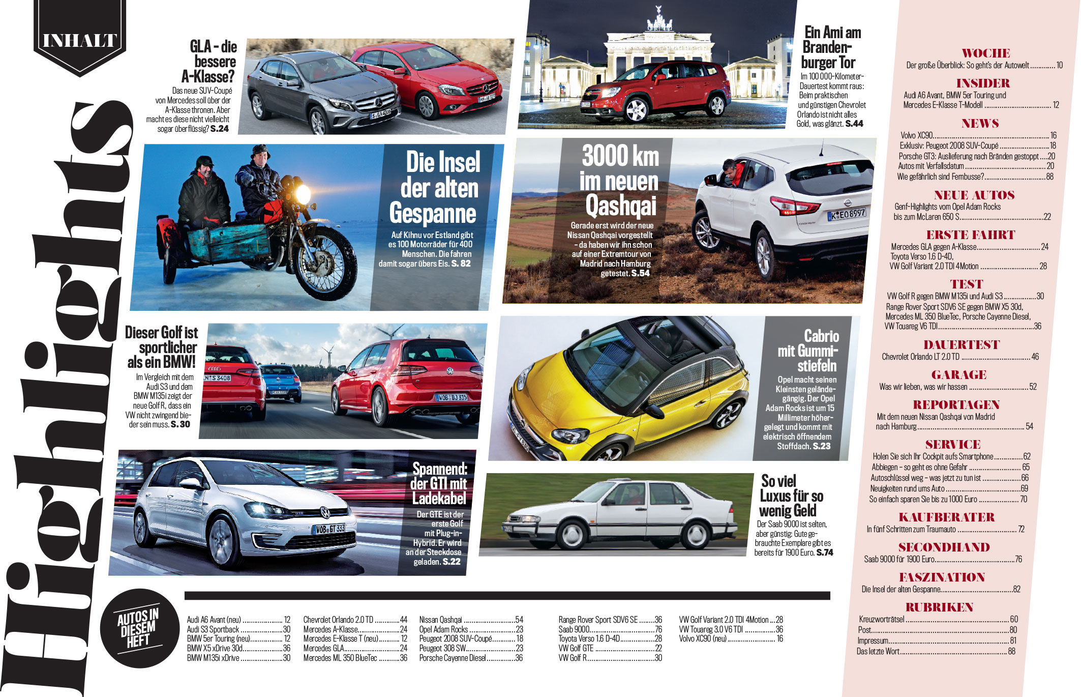
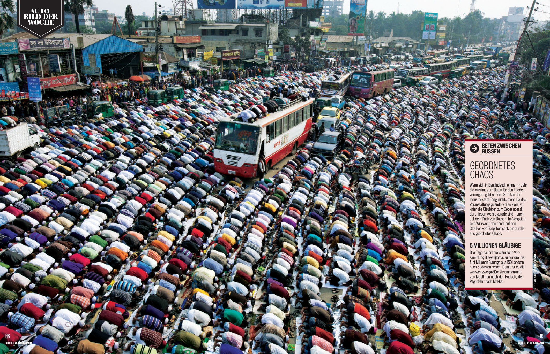
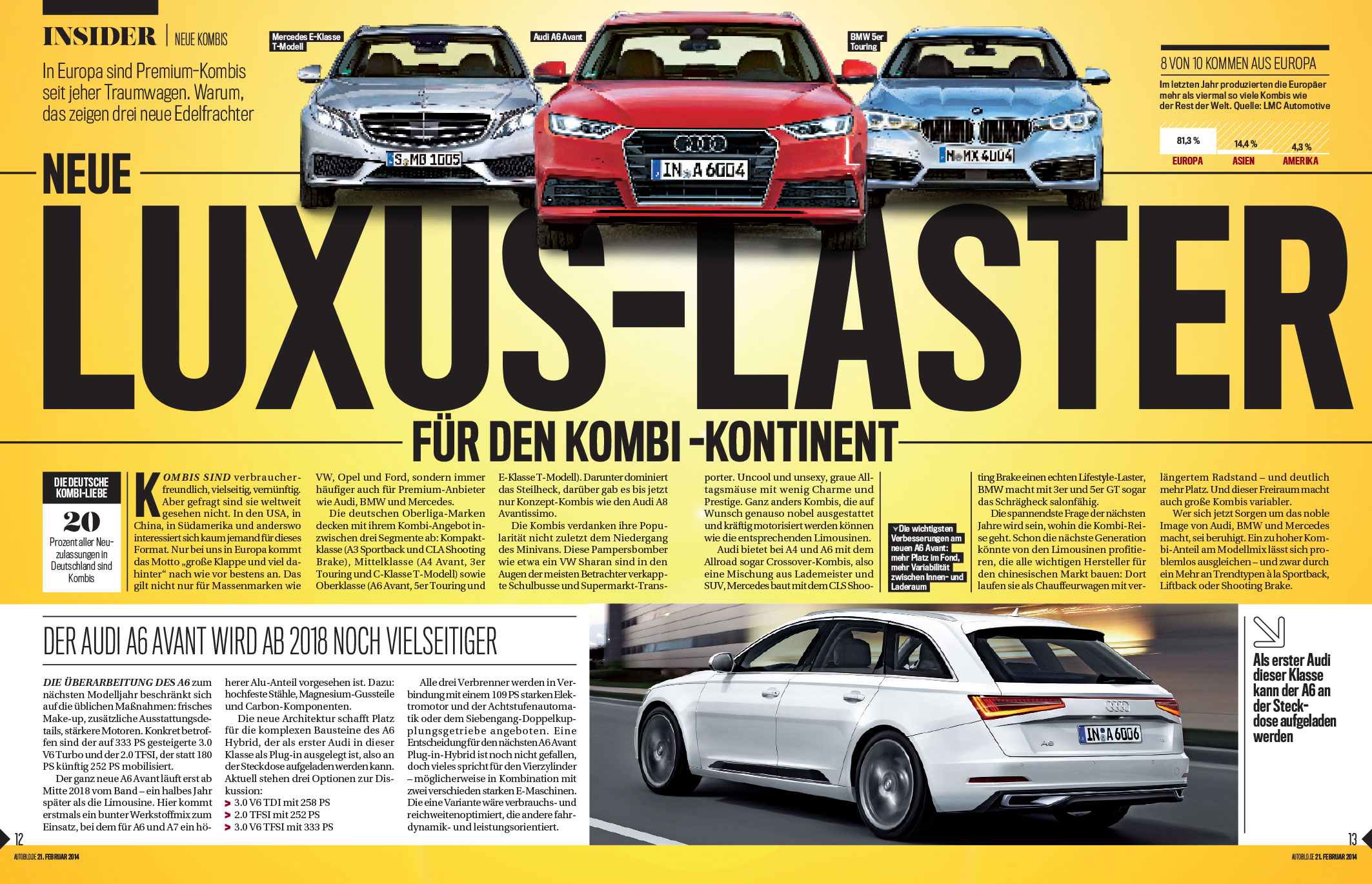
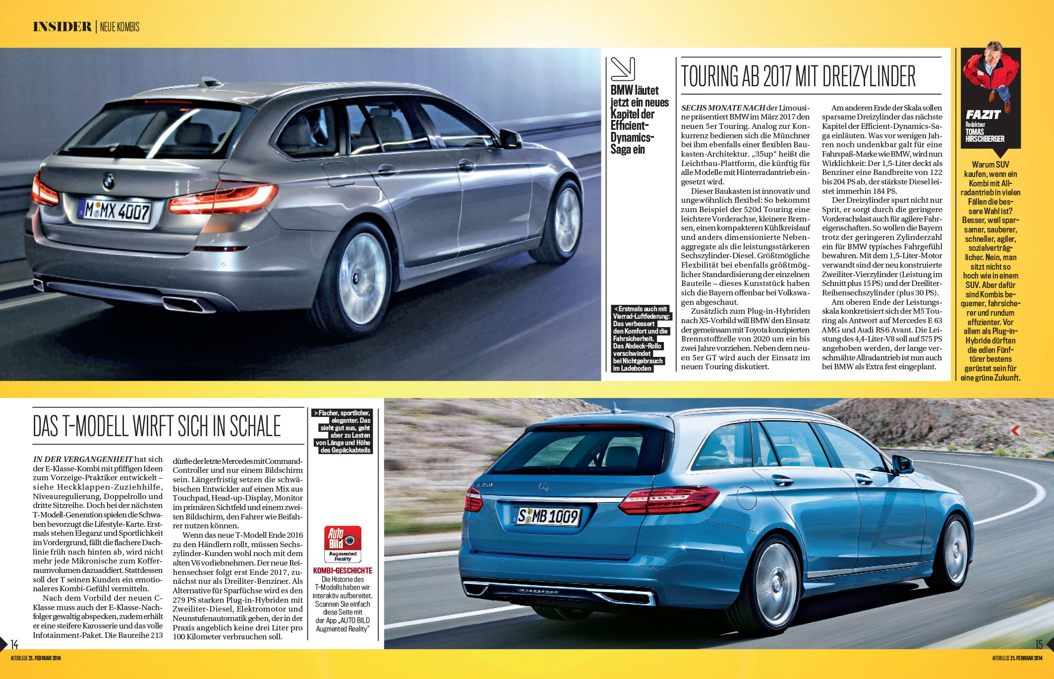
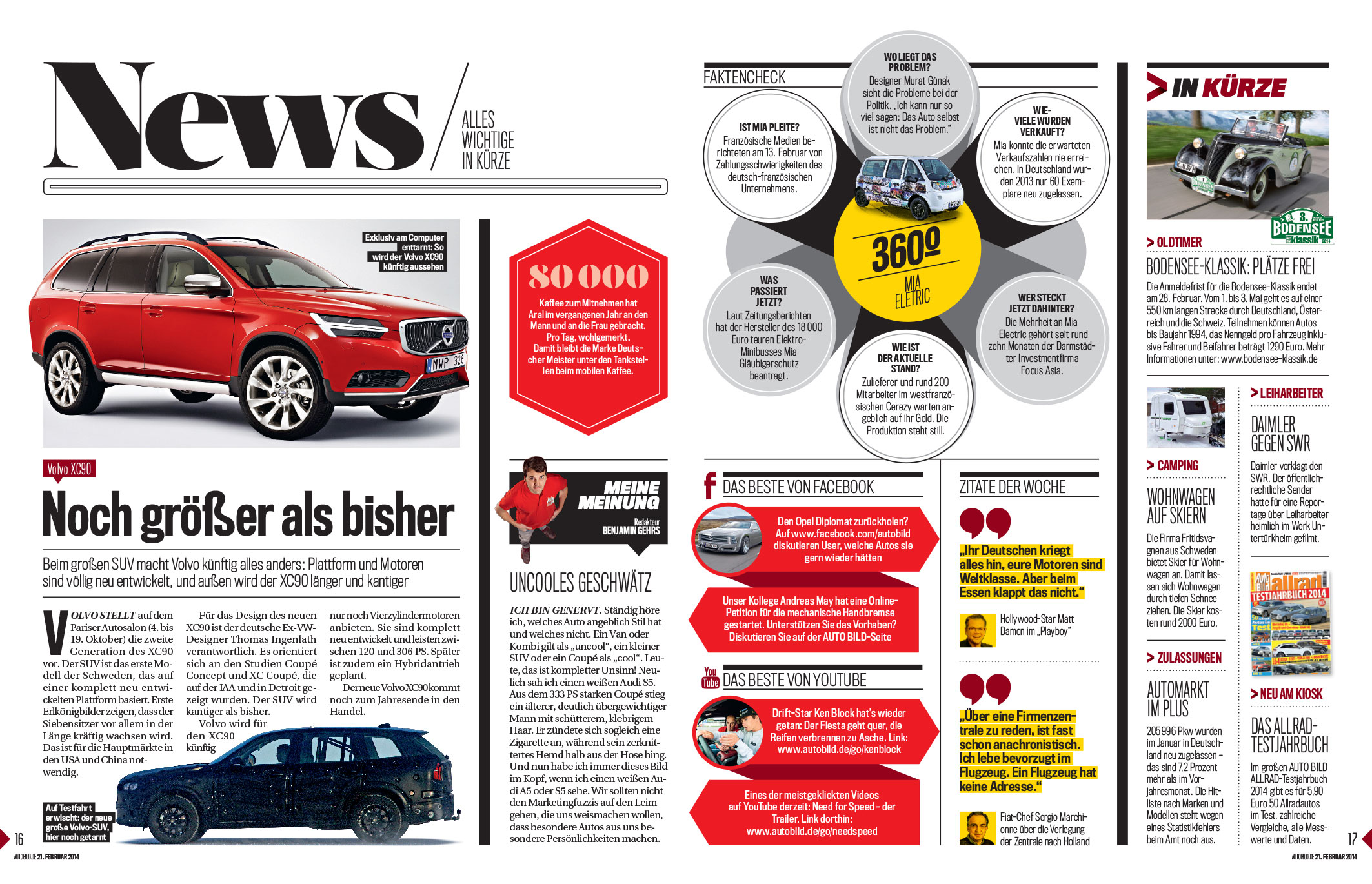
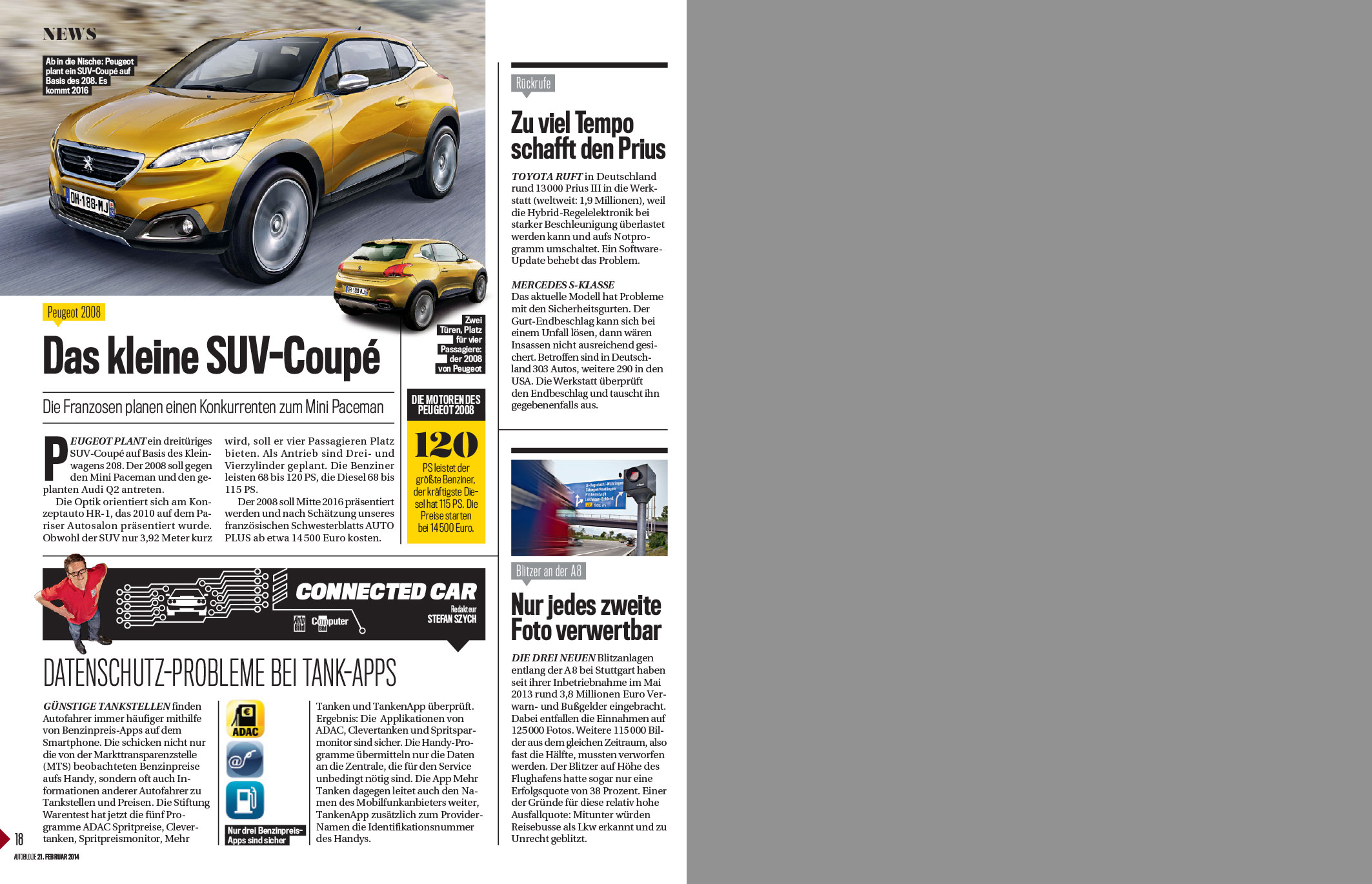
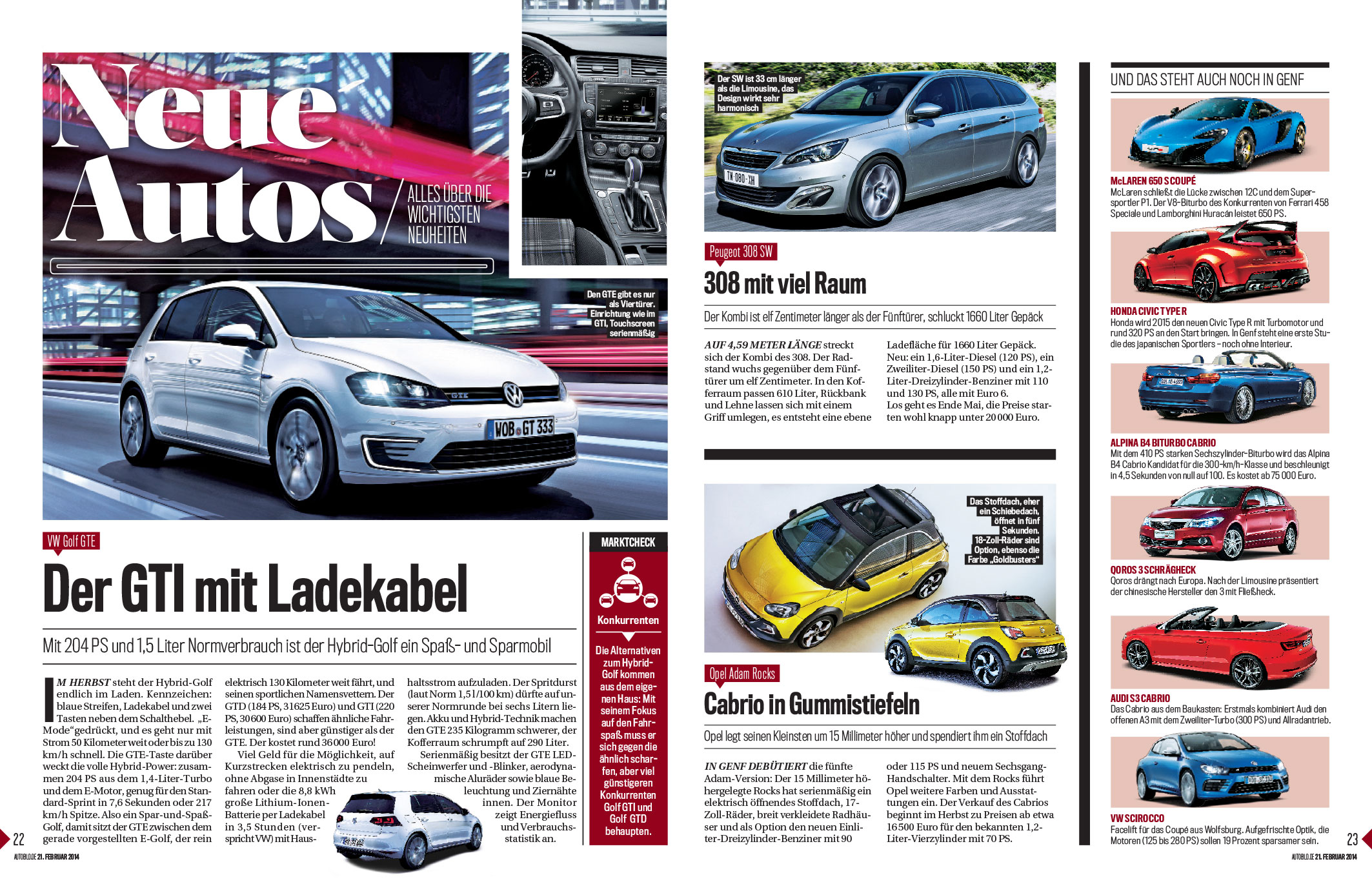
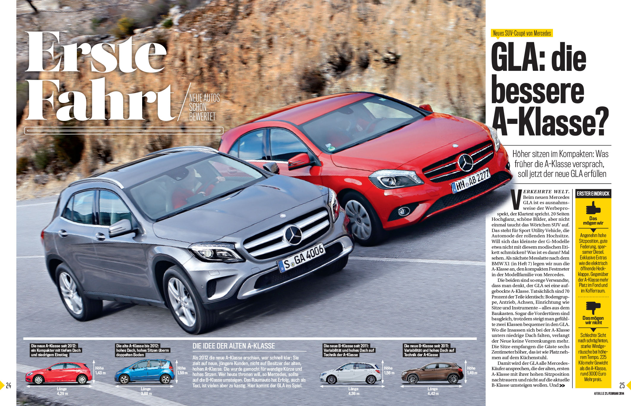
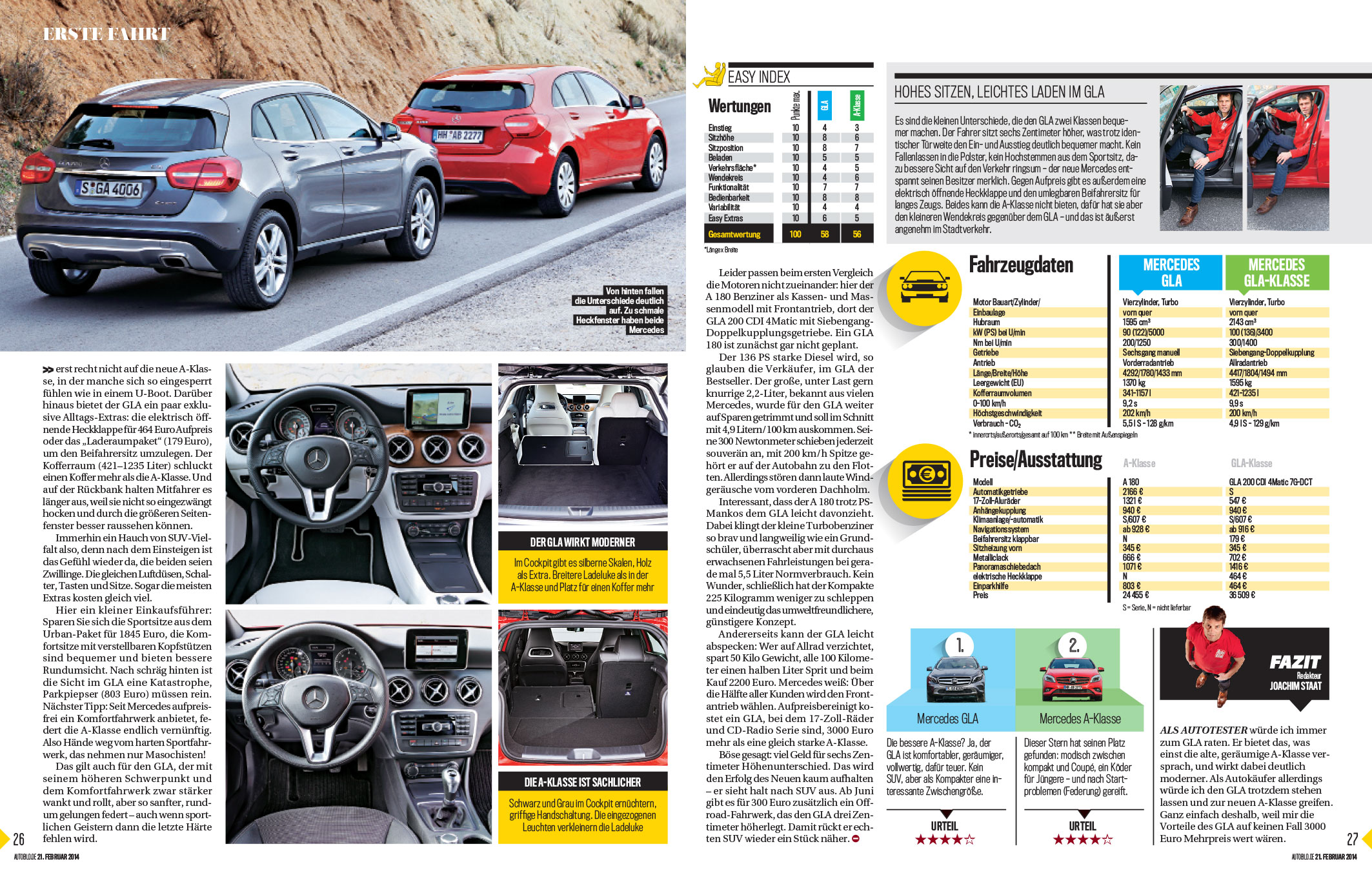
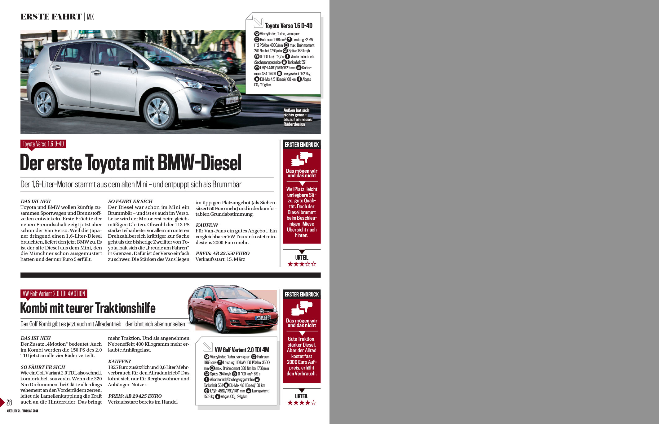
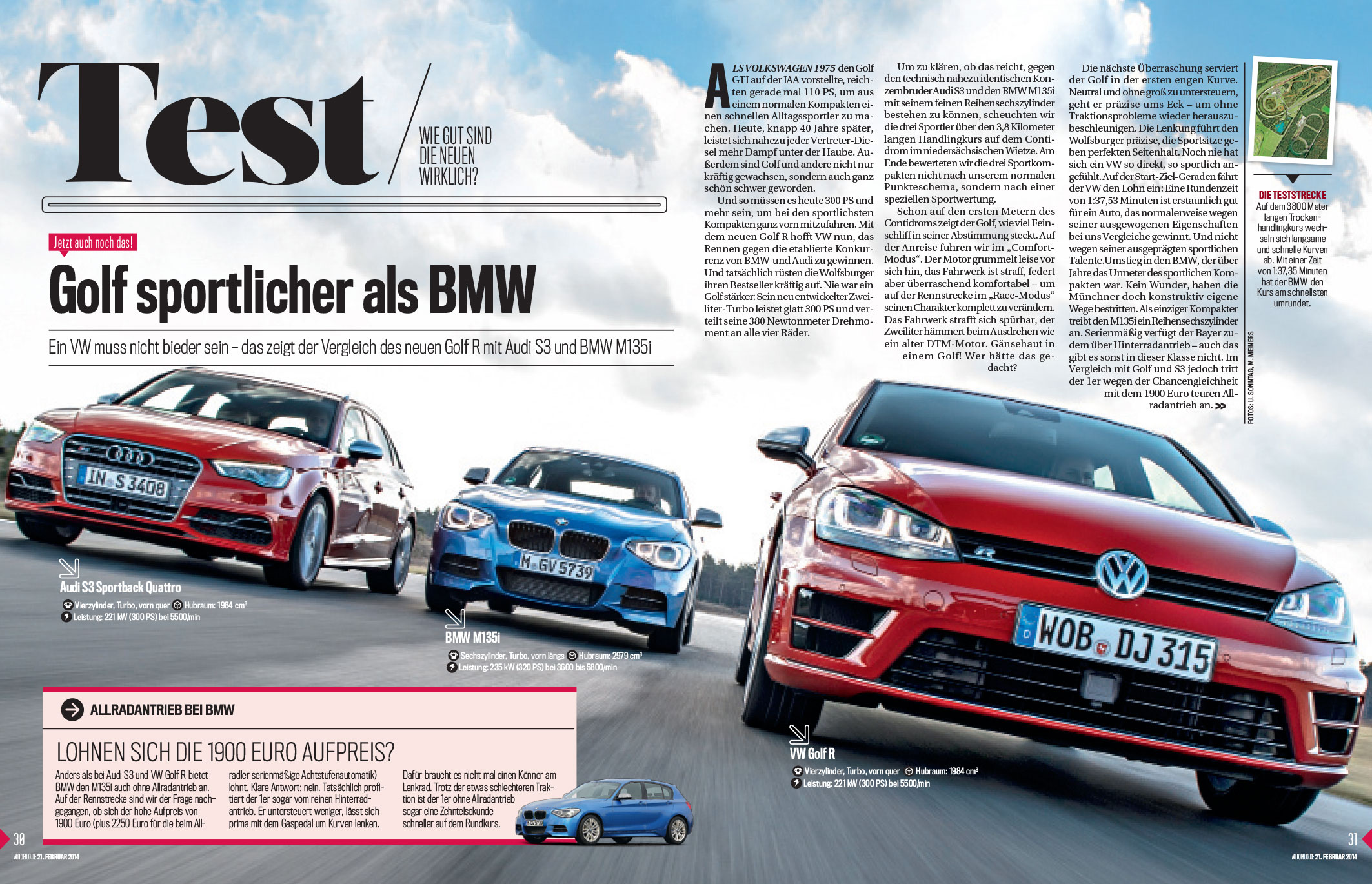
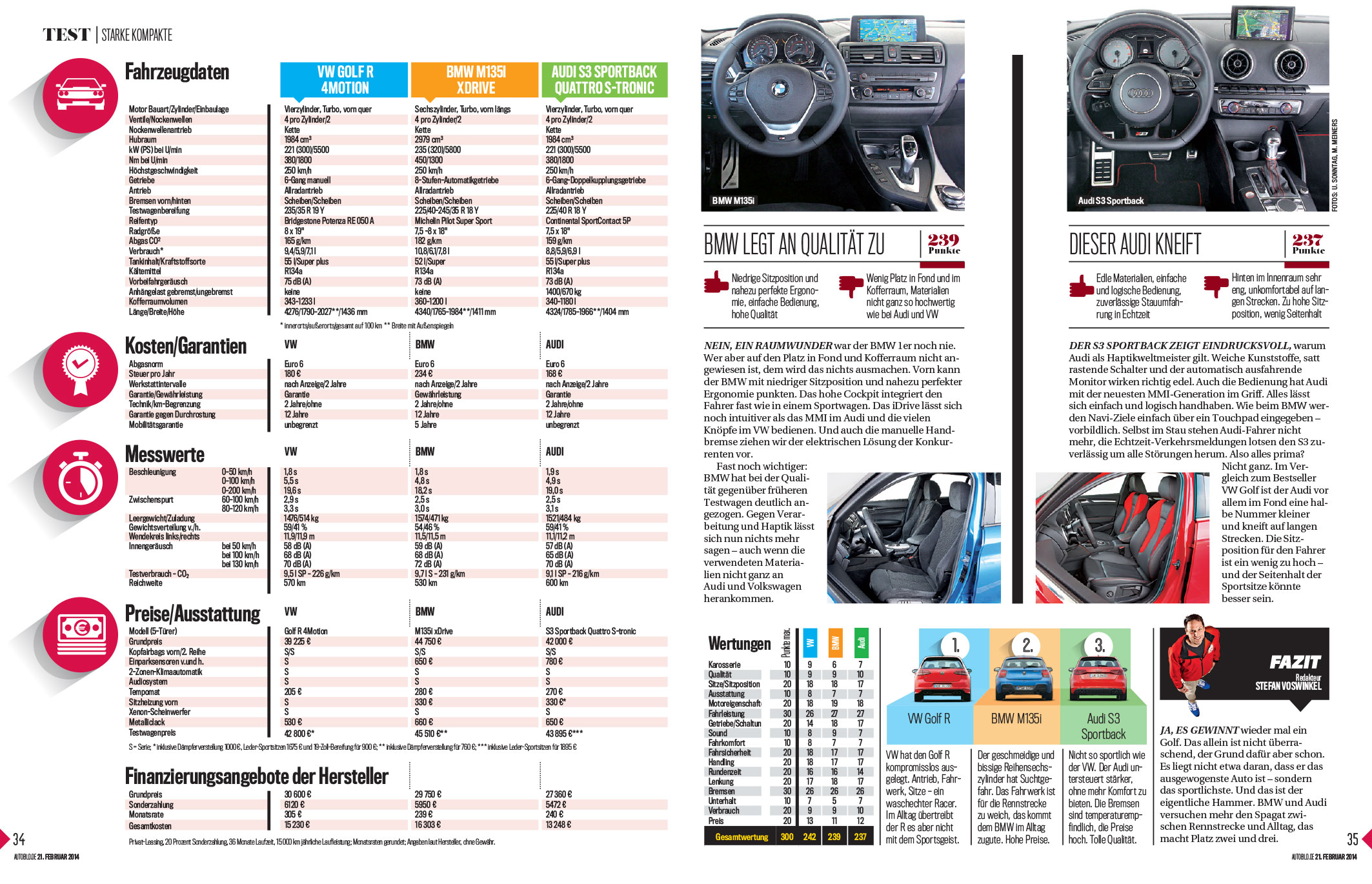
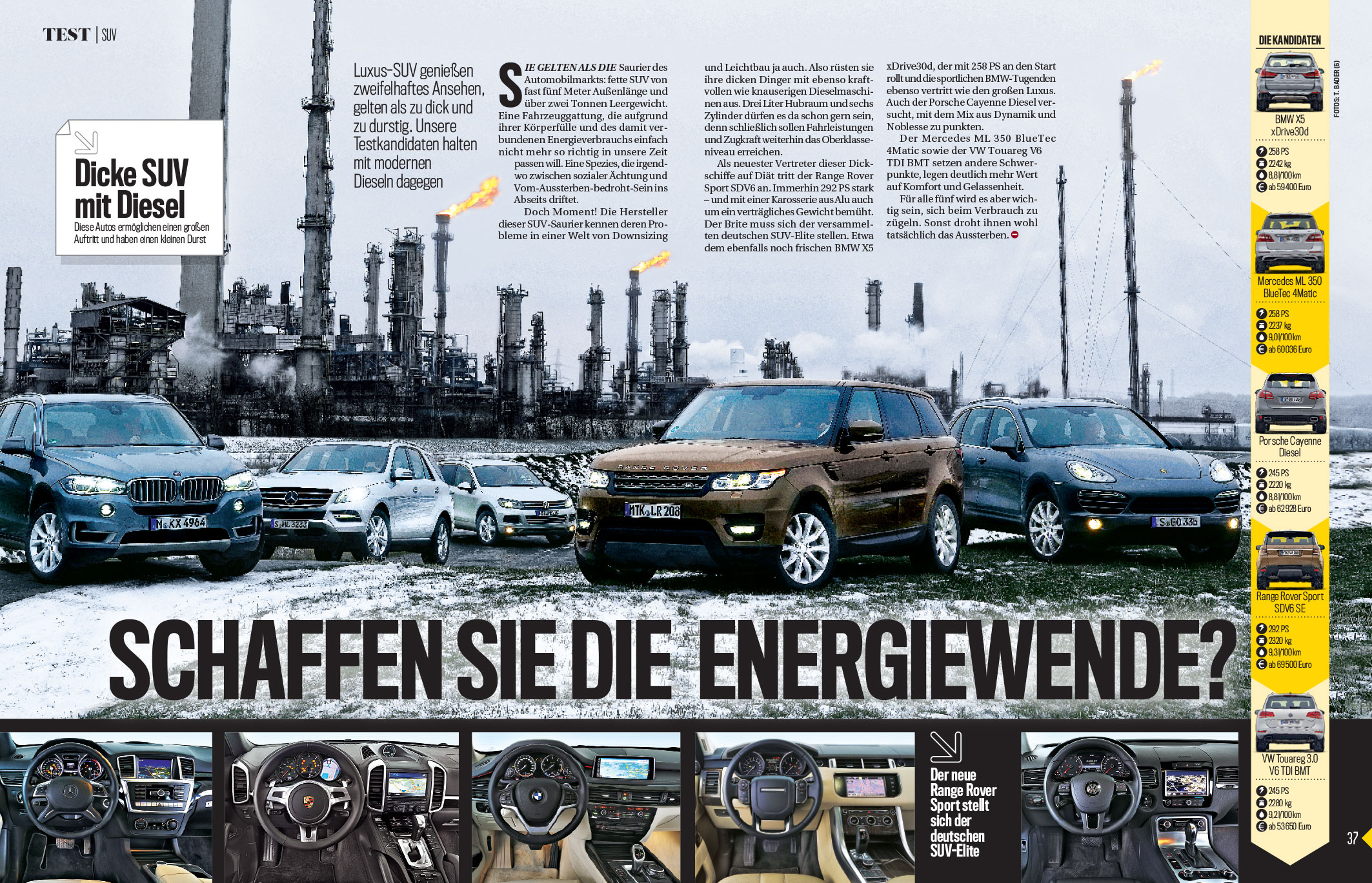
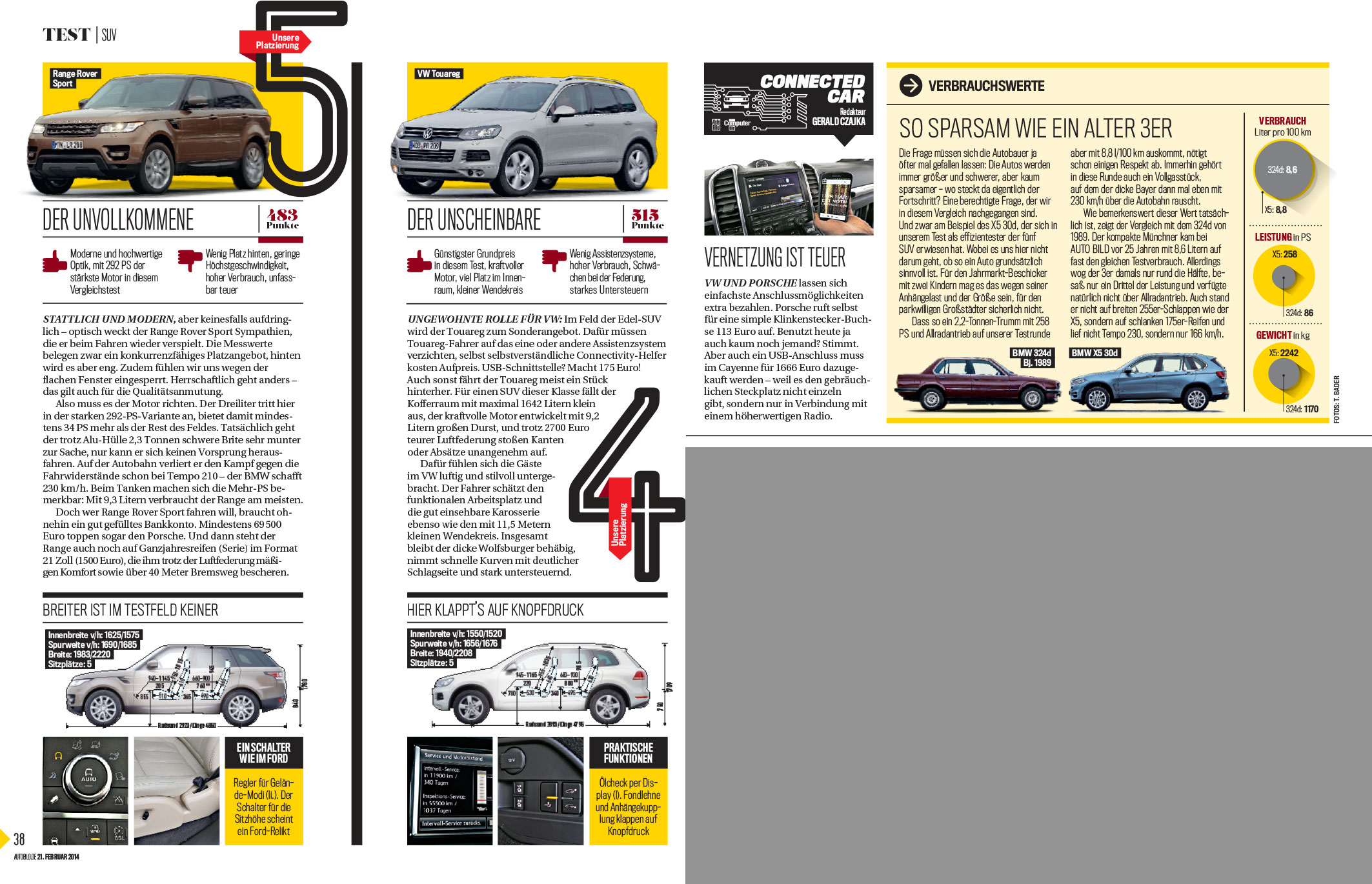
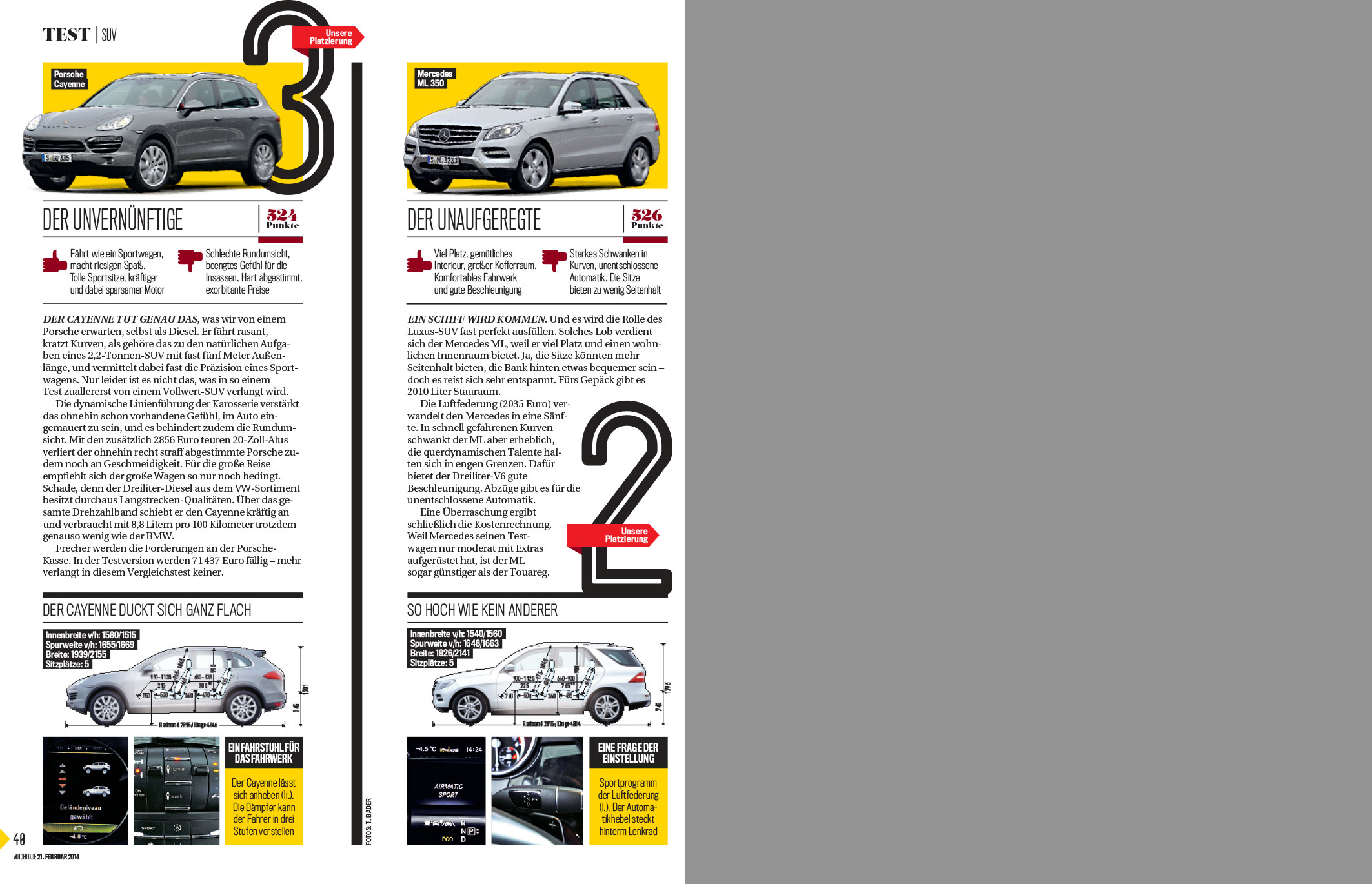
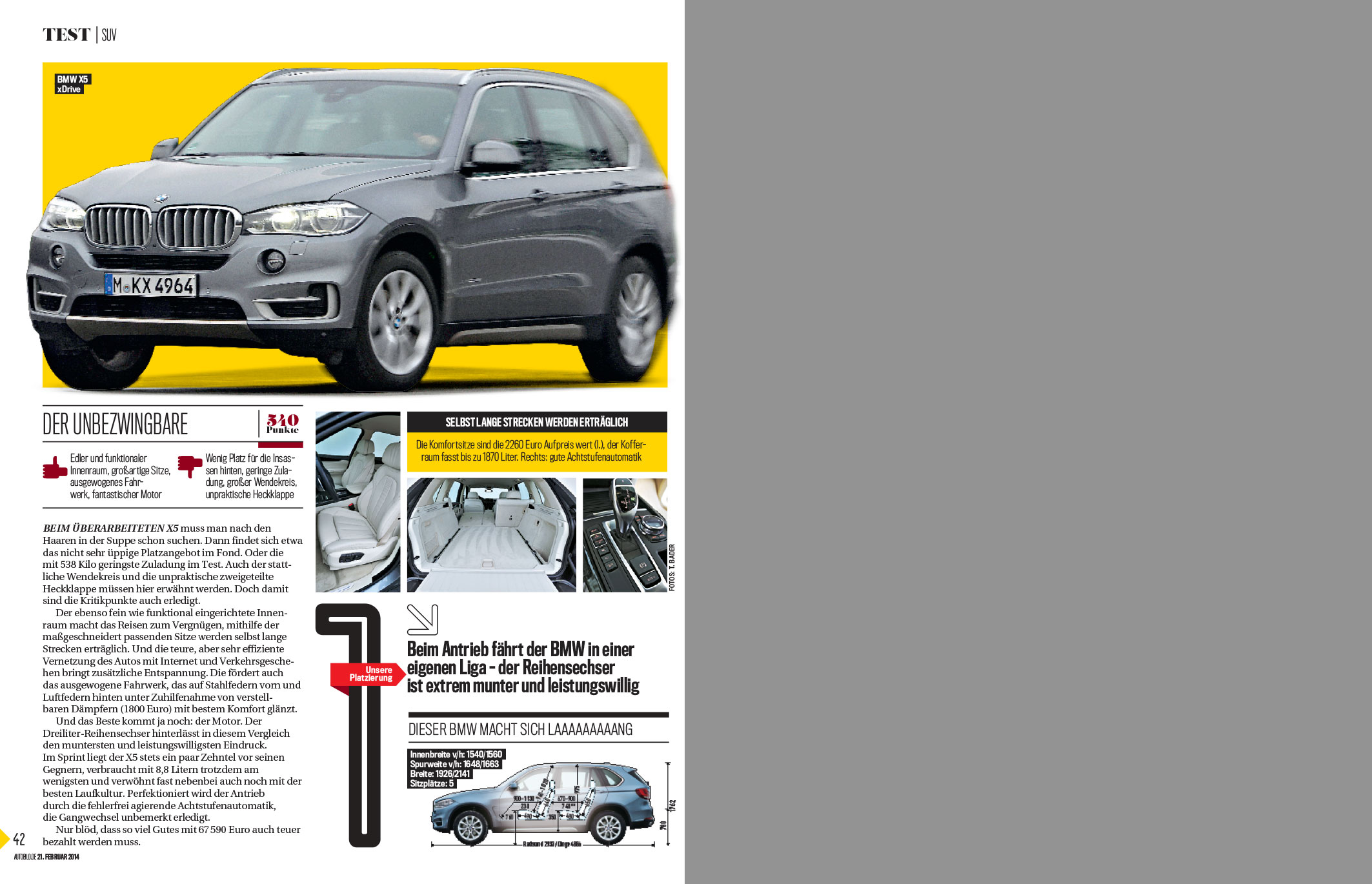
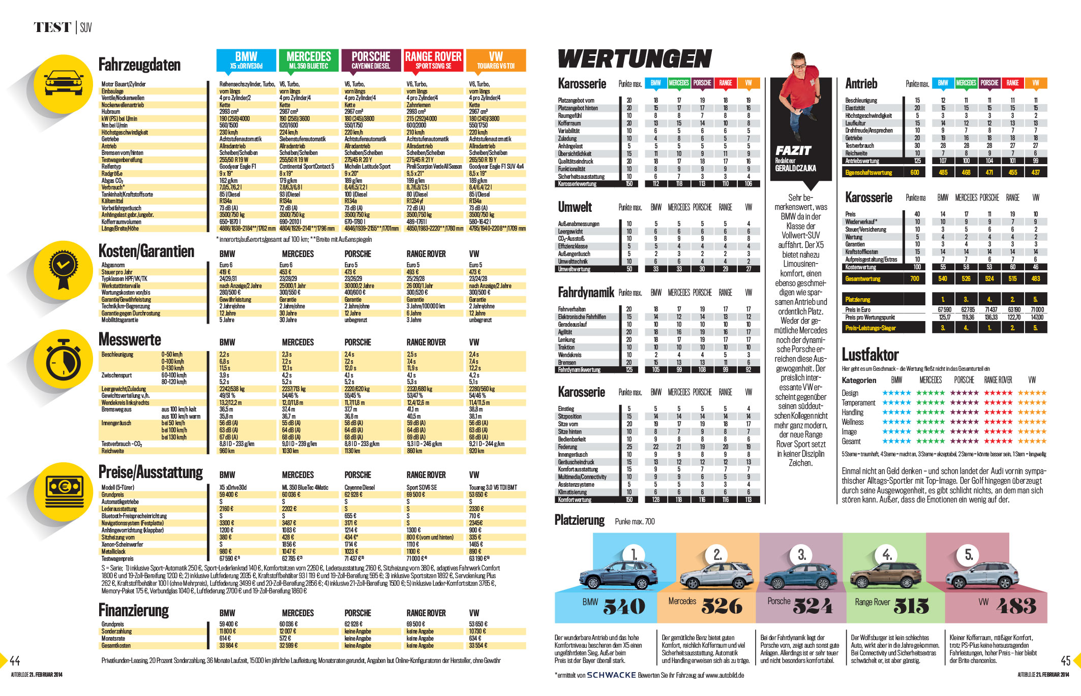
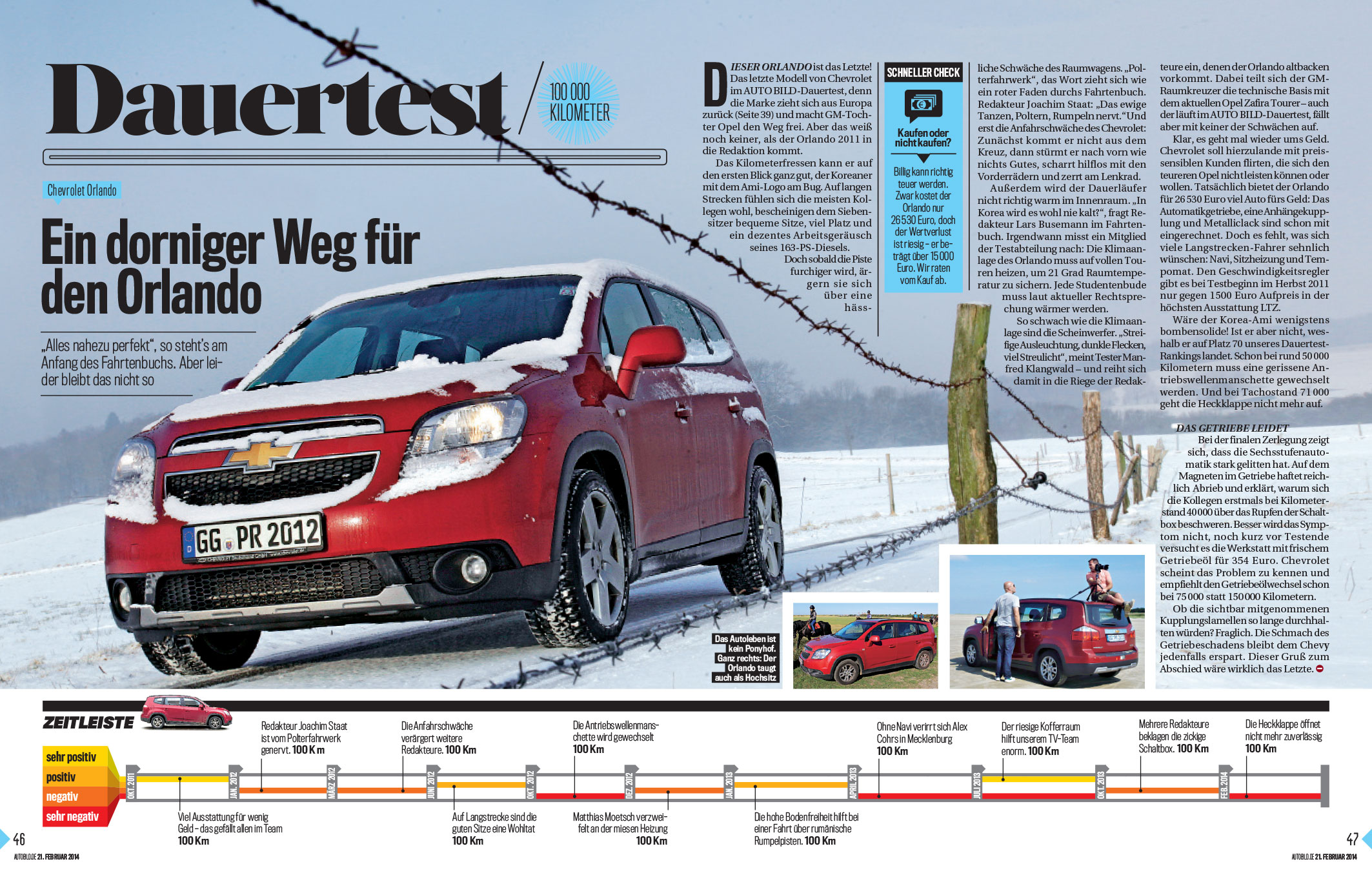
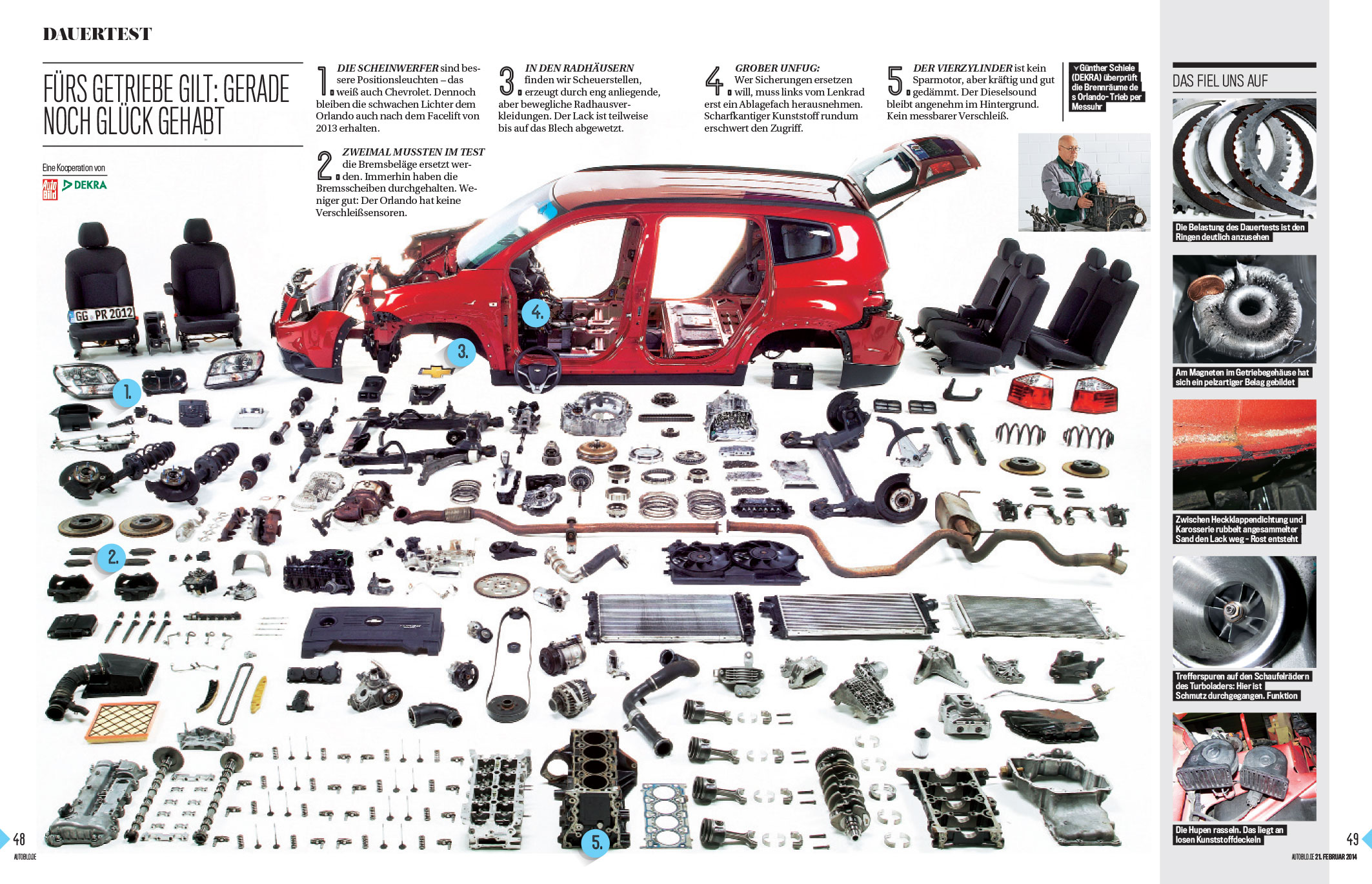
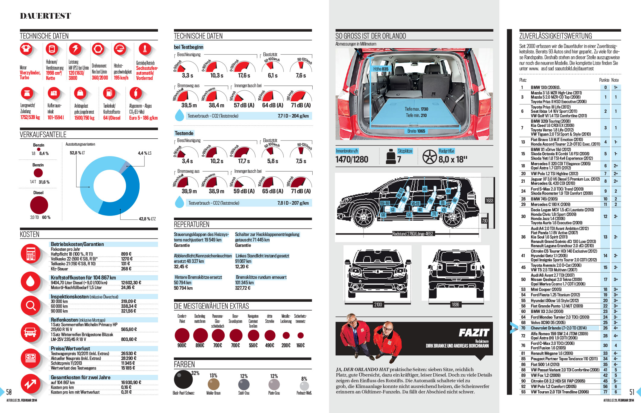
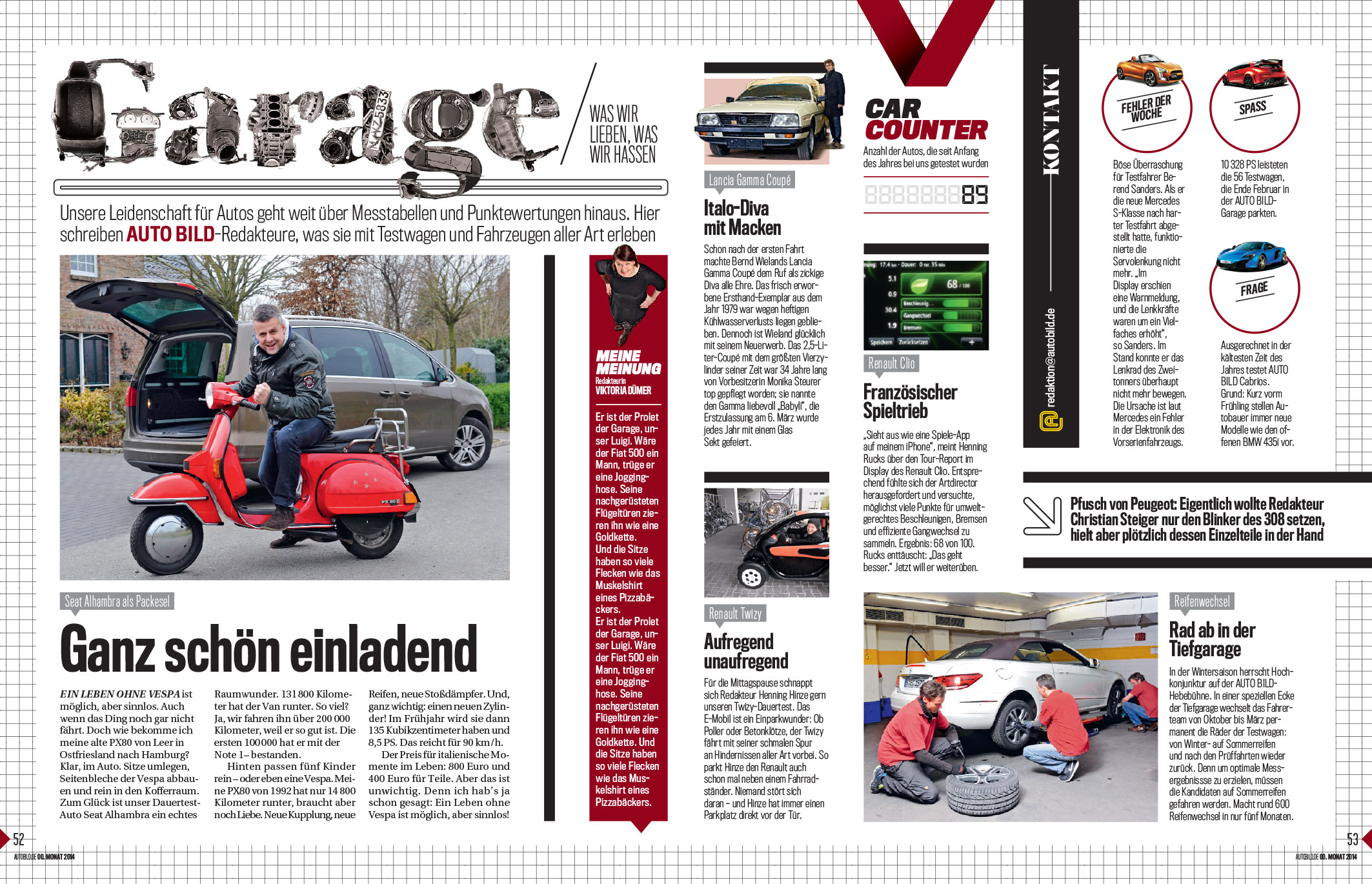
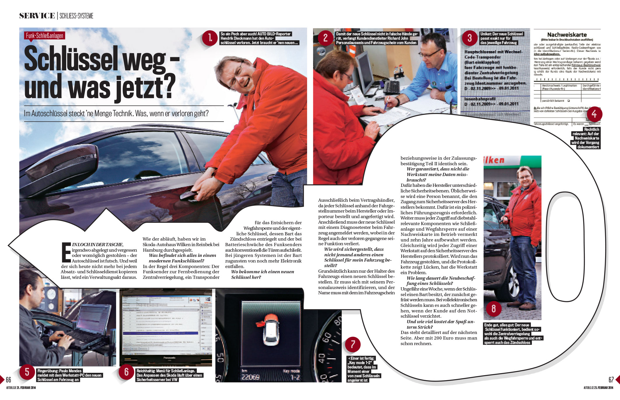
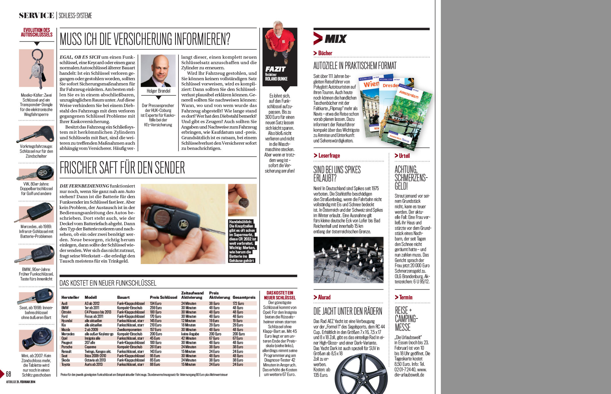
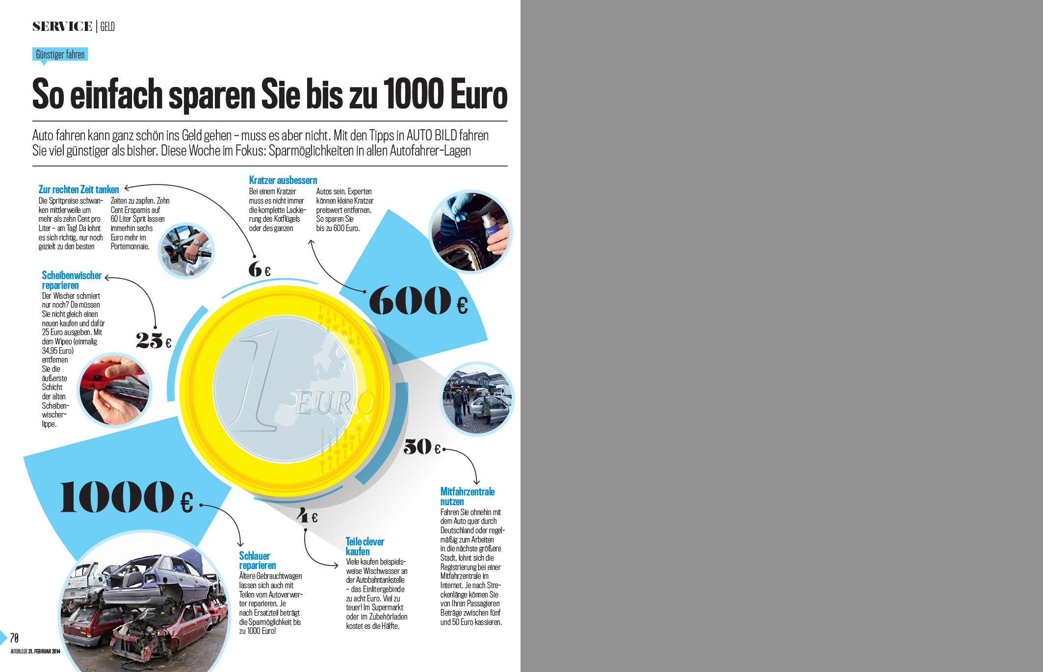
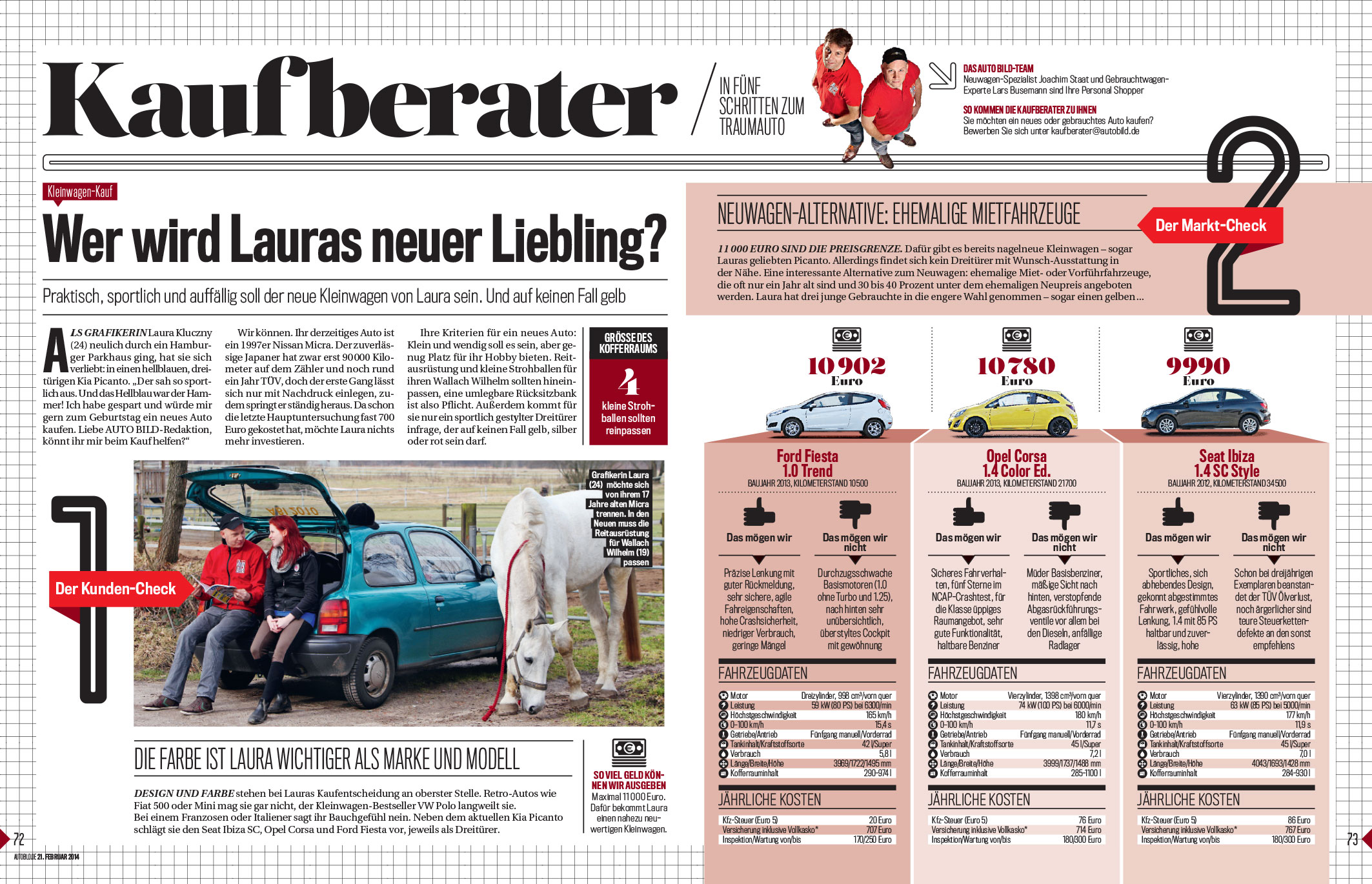
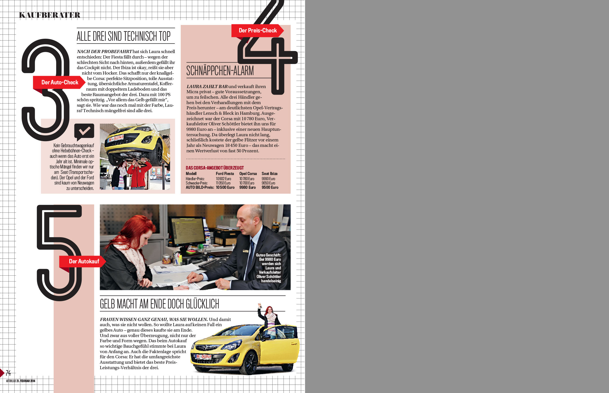
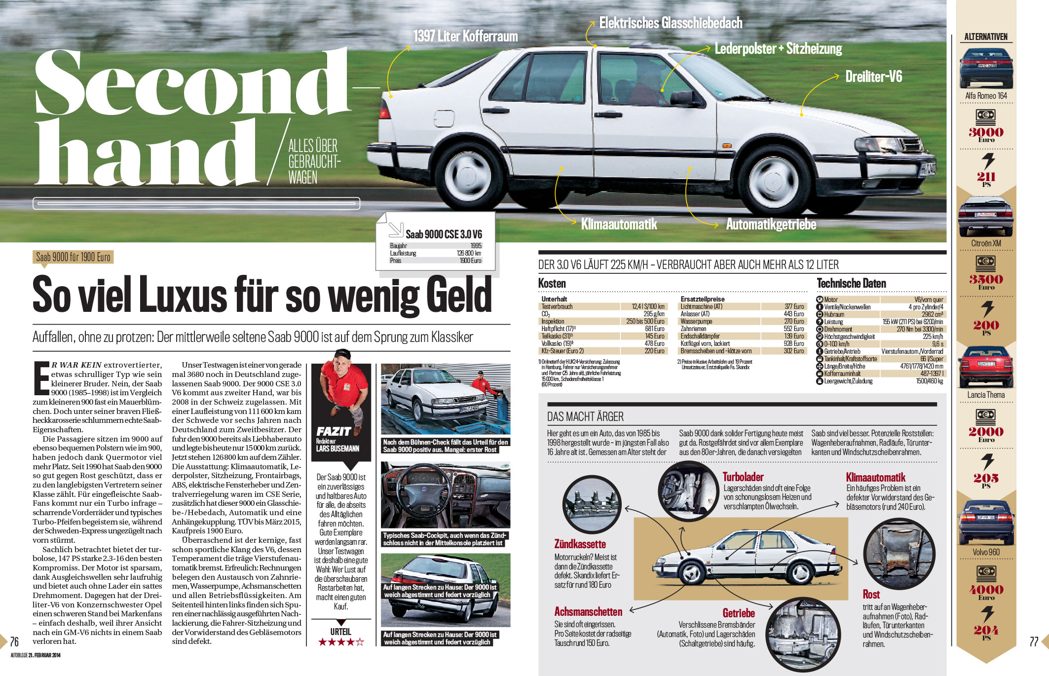
Last year I had the honor to redesign the biggest car Magazine in Europe, Auto Bild.
It was the biggest change that the magazine ever had. Typography, tables, graphics, photo language, grid, everything was rethought to make the magazine more attractive and easier to the reader.
Some weeks ago, Horizont (a specialised media magazine), evaluated the best redesigns done in Germany. Auto Bild is in the TOP 3 (with a note of 2,36 – 3 is the best) in front of traditional magazines such as Stern and Focus. I am really proud of this result, and of the amazing job done together with the Auto Bild team.
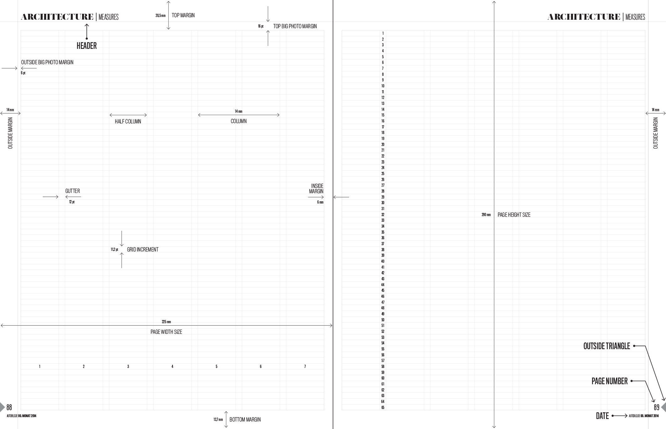
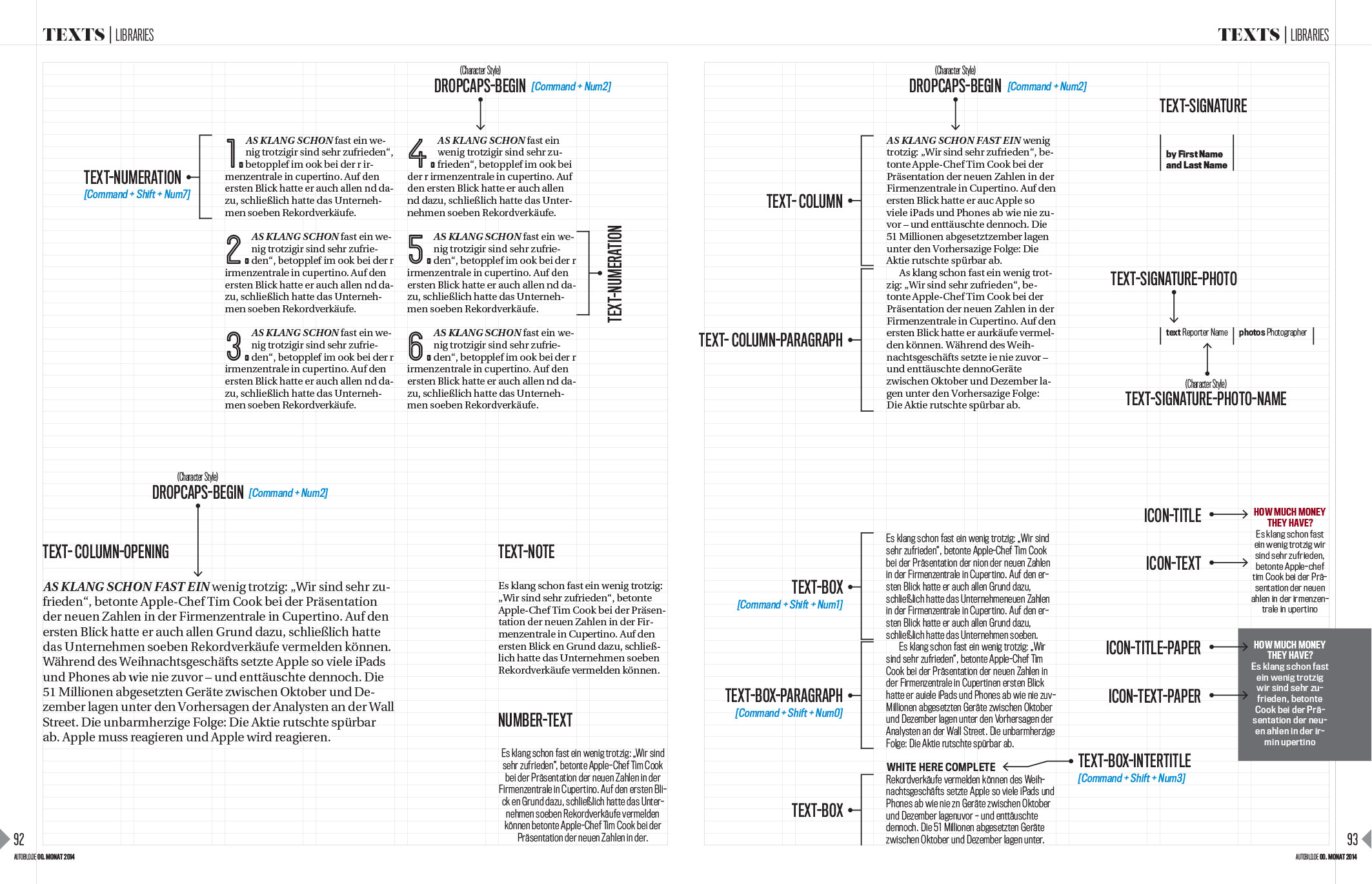
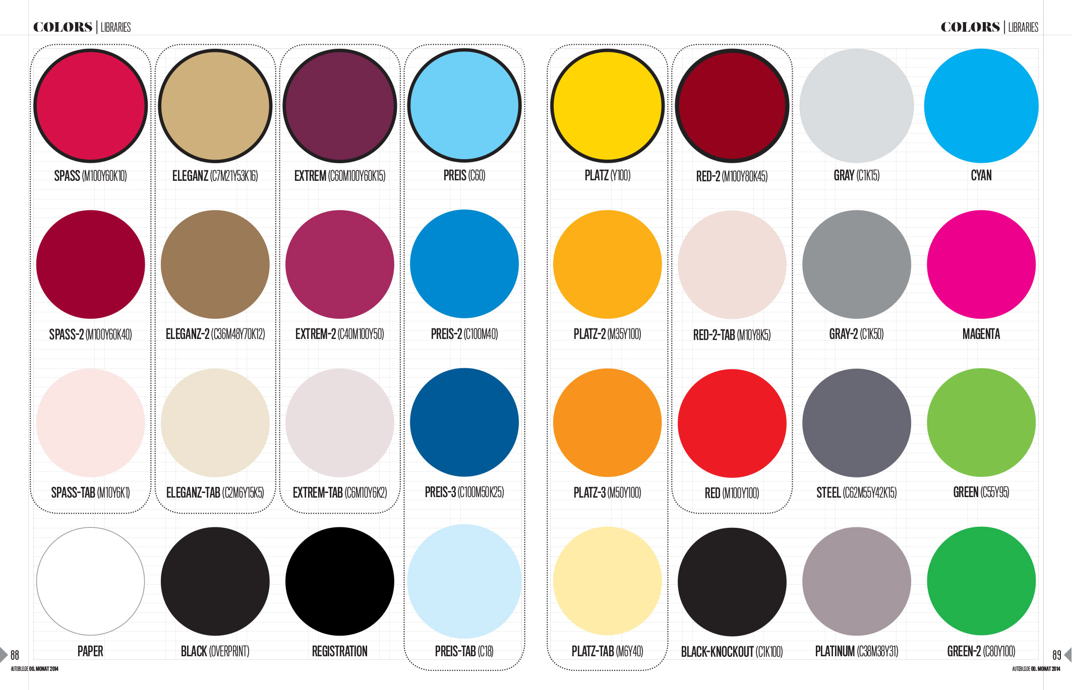
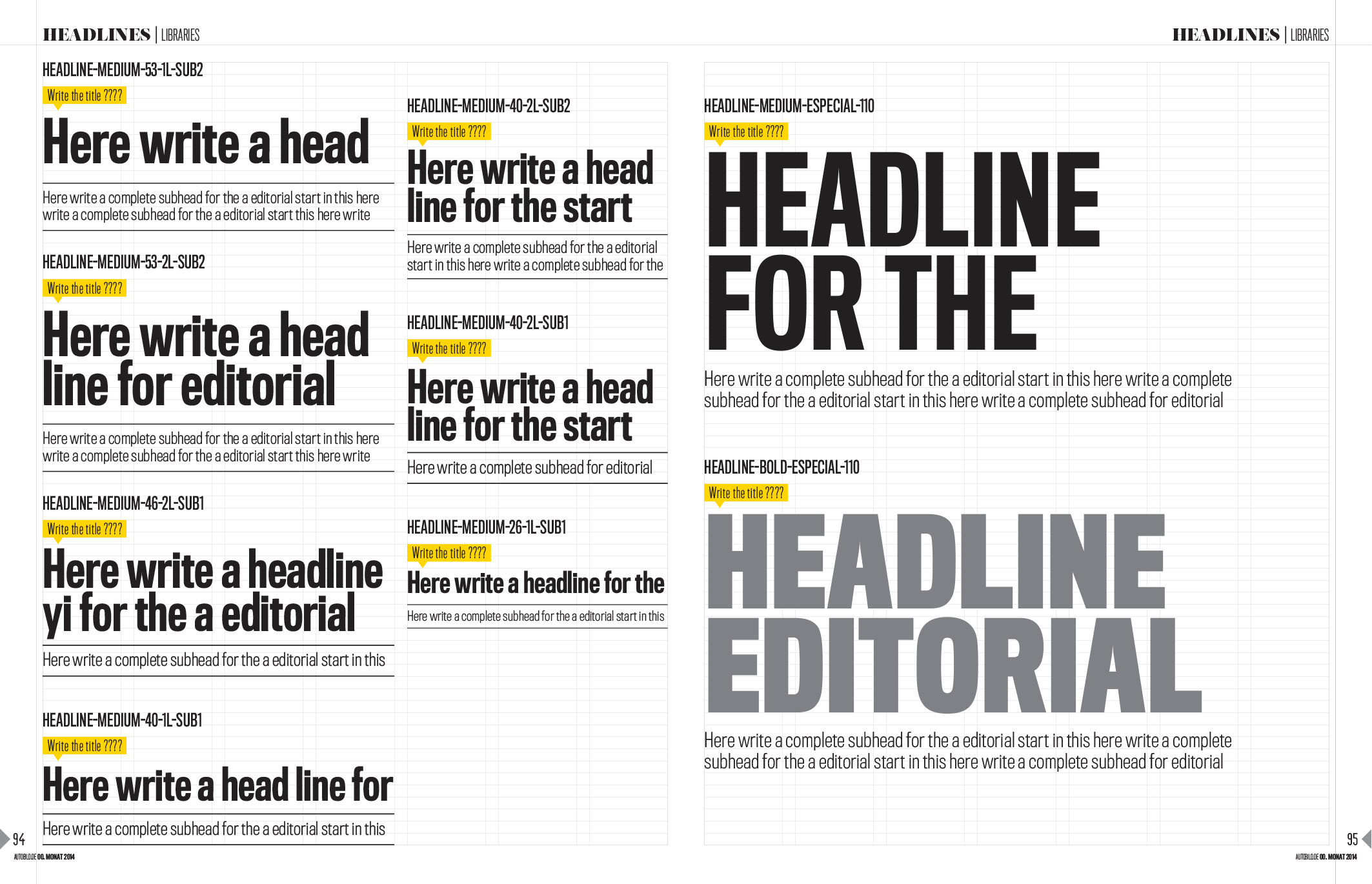
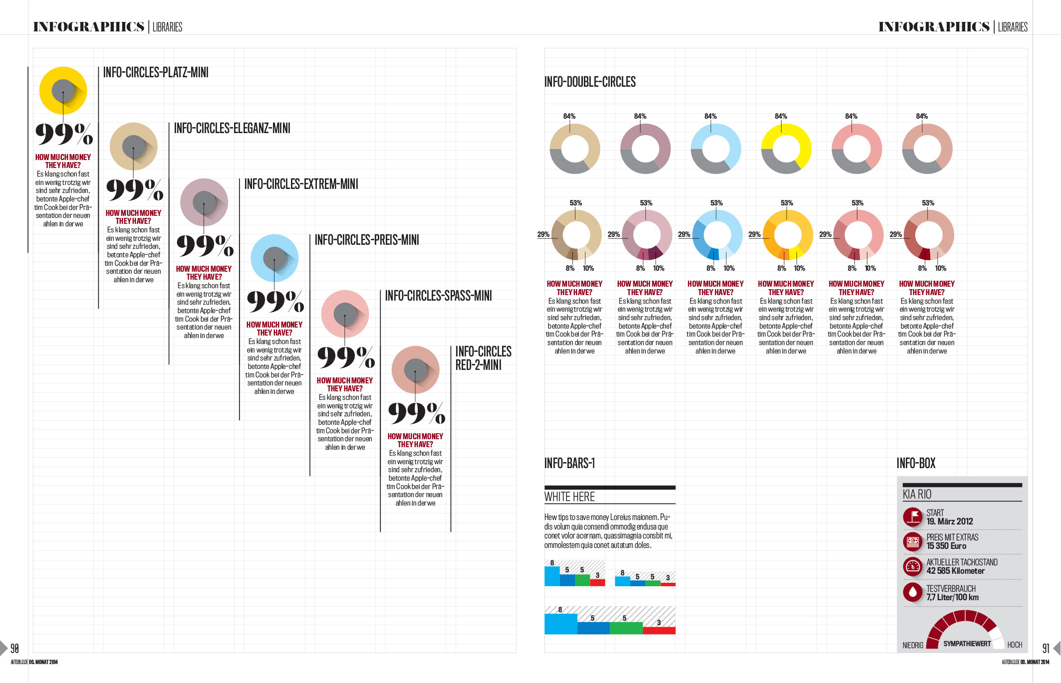
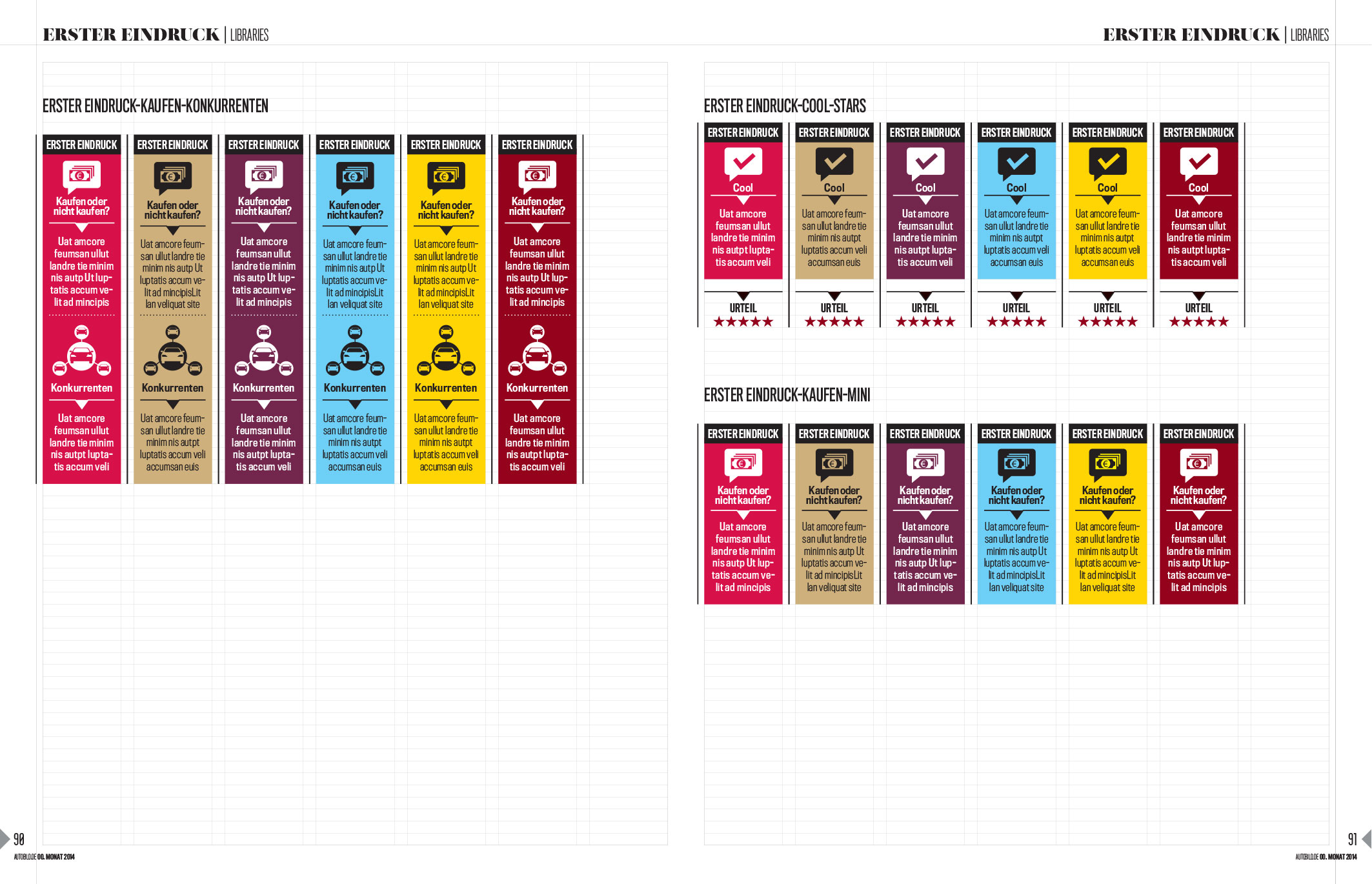
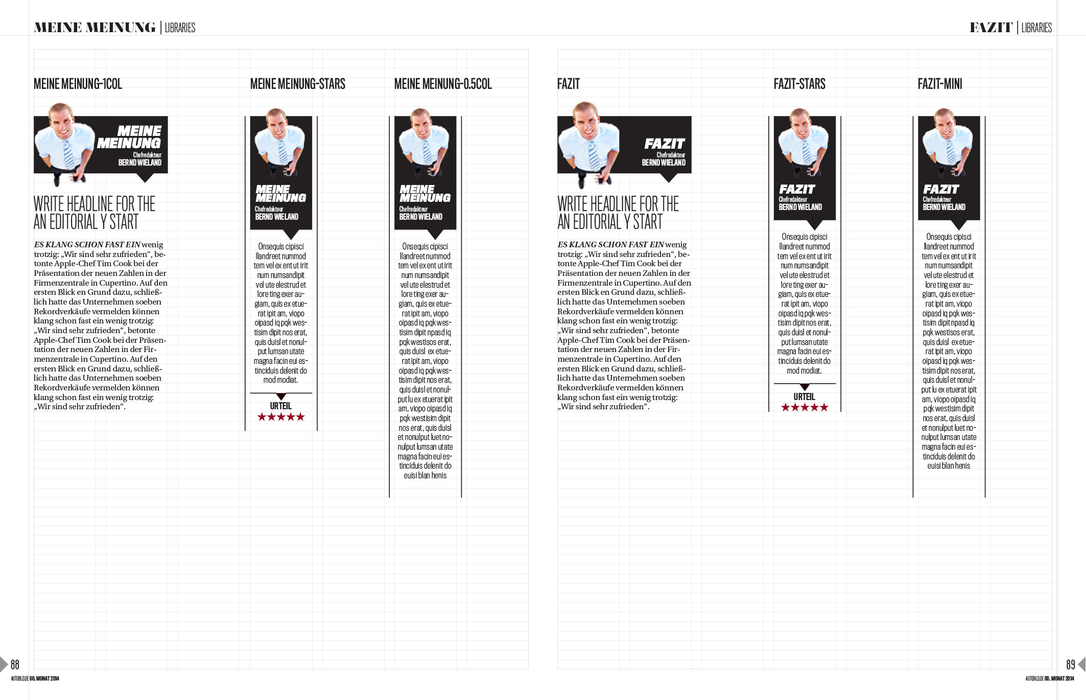
For the redesign I developed 4 “project books”: StyleBook (where is all the project: with templates and libraries; despite of the style standards of typography, color and elements), Architecture Book (where all the structure of the magazine is defined: grid, distances, lines etc) and a HandBook (that explains how content and design should work together).Bellow are some pages of the “number zero” and some very few pages of the Style Book.
Check here the “before x after” of the redesign.
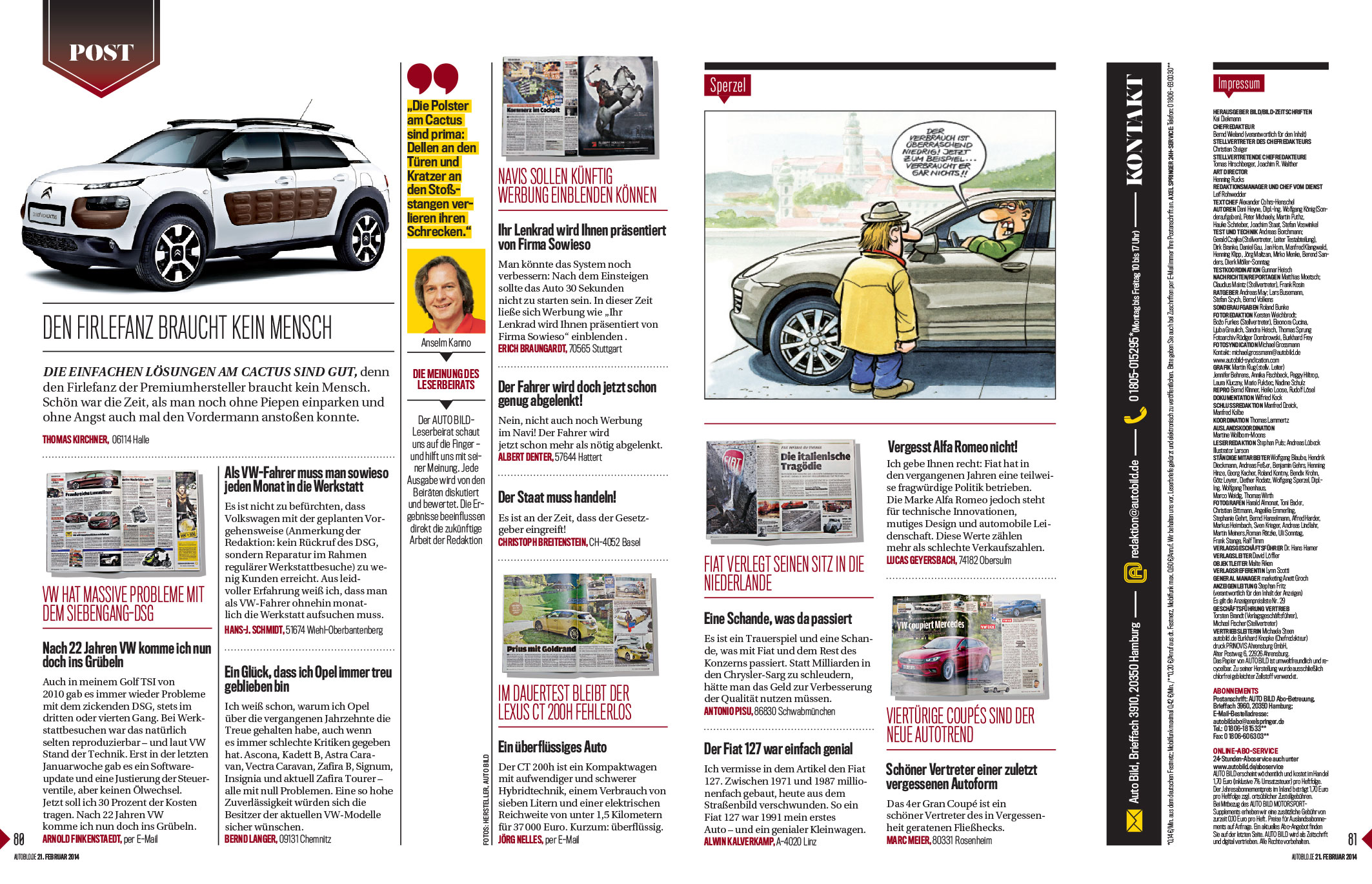
Some pages of Auto Bild redesigned
Some few pages of the Style Book
