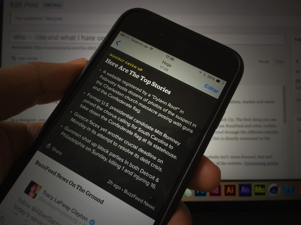
I’ve spent some time using the new BuzzFeed app launched this week. It’s an interesting case to study, in sense of journalism, market and news-design.
As a designer, one of the first things that I missed was the information hierarchy. The app’s main screen is called Catch Up. The first thing you see on launch is the Quickly Catch Up module, and then the rest of the main stream of the app is a mix of stories from BuzzFeed and other outlets. But the wrong use of information design results in a confused navigation. You can easily get lost and tired while going through the different articles.
On the other hand, the articles load fast, in contrast with many mobile news sites. It’s so far the best performance I have ever experienced in any news app. And yes, this is directly connected to the design decisions you take.
As a journalist, the approach from BuzzFeed impressed me a lot. The app is everything the website isn’t: news-focused, fast and serious. It doesn’t have any LOL or “cute!” logos to click, probably trying to solve a trust problem of the website (interesting article about it here).
If this is going to work or not, only the time will tell us.
Will be interesting to see how the App will develop in the next months. In an interview with the BuzzFeed news-apps editor Stacy-Marie Ishmael this week, she says:
“It’s helpful to signal to people when they’ve “finished” something, even though news itself is never “over.” It’s also useful from an editorial perspective — did what we select form a cohesive and useful whole for someone browsing through? And endless scroll is a challenging user experience on mobile”For me, this is one of the main positive points on the app: a feeling of a real selection in the huge universe of interesting stories, instead of the “endlessly scrolling articles” function that many News products are using in the last time and can be really challenging when it’s about mobile navigation.
